 Mehtab Hussain
At-Home STI Test Website
Designing a discreet, trustworthy website for Visby, the first at-home PCR test for the three most common curable STIs for women, from first click to same-day care.
- Role
- UI UX Designer
- Service
- UX Design · Web Design · Responsive Design
- Team & duration
- Team of 4 · 3 months
- Tools
- Figma
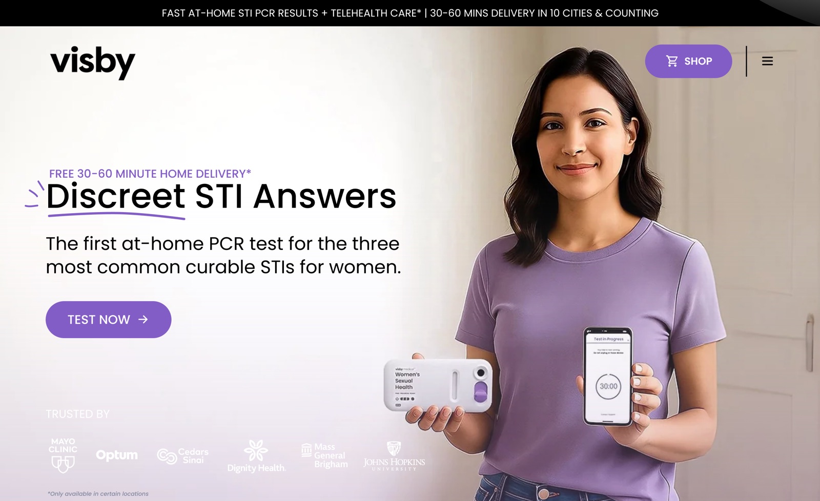
A sensitive test deserves a calm, private experience.
Visby makes a lab-quality PCR test that women can take at home, with results in about 30 minutes and same-day telehealth if they test positive.
The goal: a website that explains the product clearly, earns medical trust fast and guides women from first visit to ordering a test.
- STI testing carries stigma, so many women delay it
- Clinic visits, lab waits and red tape slow people down
- Most infections show no symptoms, so the urgency isn’t obvious
- Medical claims need to be clear without sounding cold or scary
Make a medical product feel discreet, credible and empowering in one scroll.
From product facts to a guided story.
- 01
Discover
Product, medical claims and competitor sites.
- 02
Define
Audience, fears and the questions to answer.
- 03
Structure
Sitemap, page flow and content order.
- 04
Design
Visual language, pages and components.
- 05
Adapt
Mobile layouts and iteration on feedback.
Designing for trust before conversion.
Every page decision was checked against four principles, written for women who want answers without judgement.
Discreet by default
Soft lilac tones, real people and plain wording keep the topic warm, never clinical or embarrassing.
Prove it early
FDA authorisation, CDC data and trusted-by logos appear high on the page to answer “is this real?”.
Clarity over jargon
Short headlines, one idea per block and numbered steps turn a medical process into something easy to follow.
Empower, don’t scare
Health risks are framed around action (“Early test = no lasting damage”) with a clear next step each time.
Eight pages, one clear path.
The home page tells the story. Supporting pages answer the deeper questions: how to test, what it detects, where to buy and who is behind it.
One scroll from curiosity to confidence.
The home page follows the questions a visitor asks, in order: what is it, can I trust it, how does it work, why does it matter, and what next.
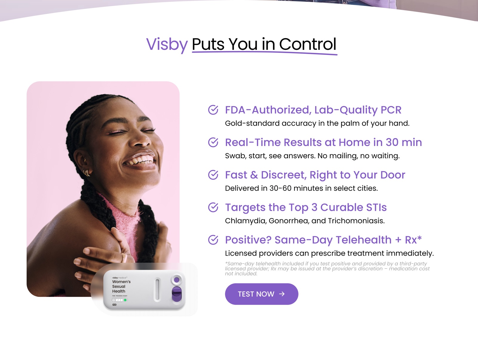
Benefits a visitor can scan in seconds.
Five checkmarked benefits answer the big questions at once: accuracy, speed, privacy, coverage and care if you test positive. The device is shown in hand to make it feel real and small.
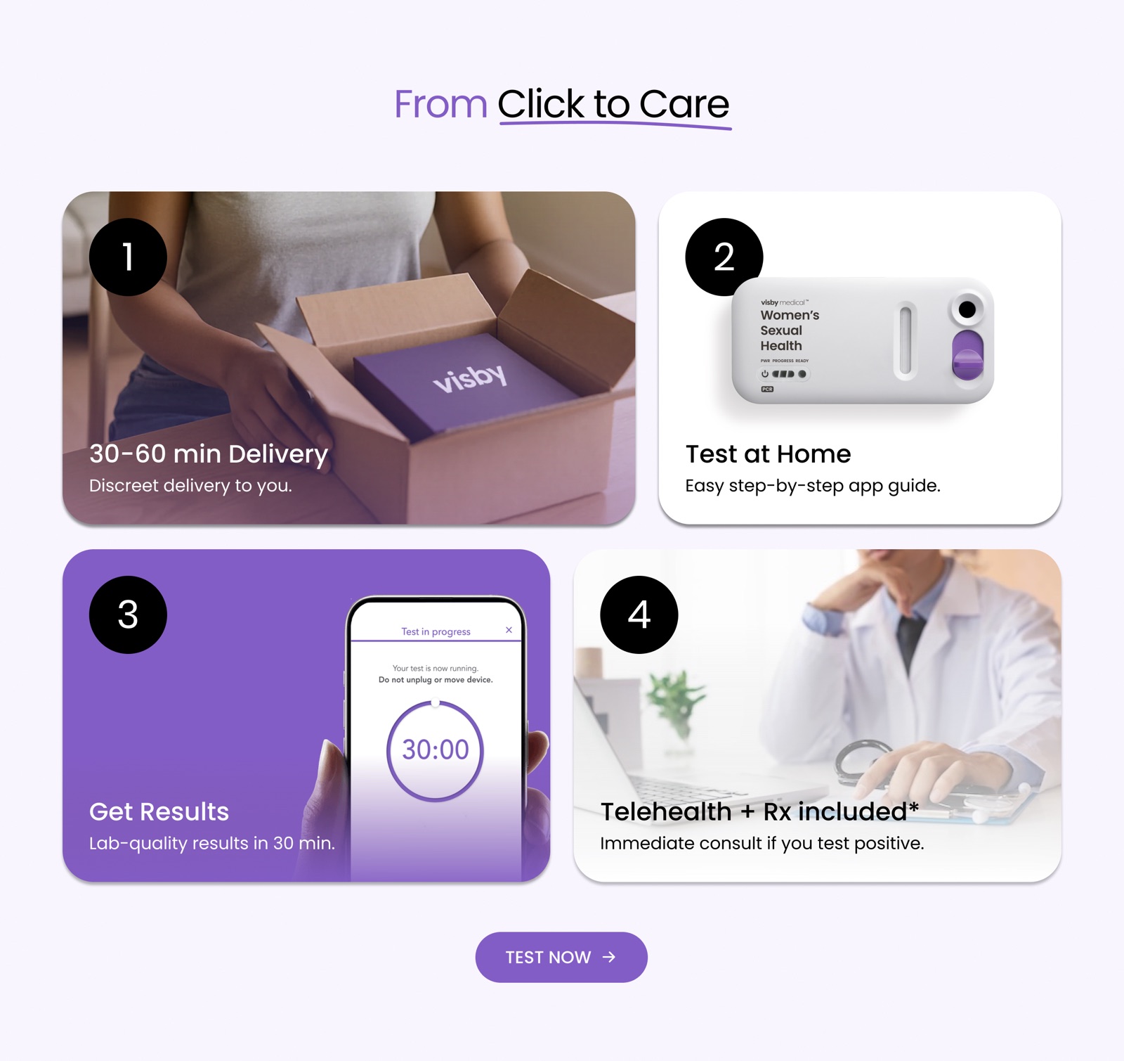
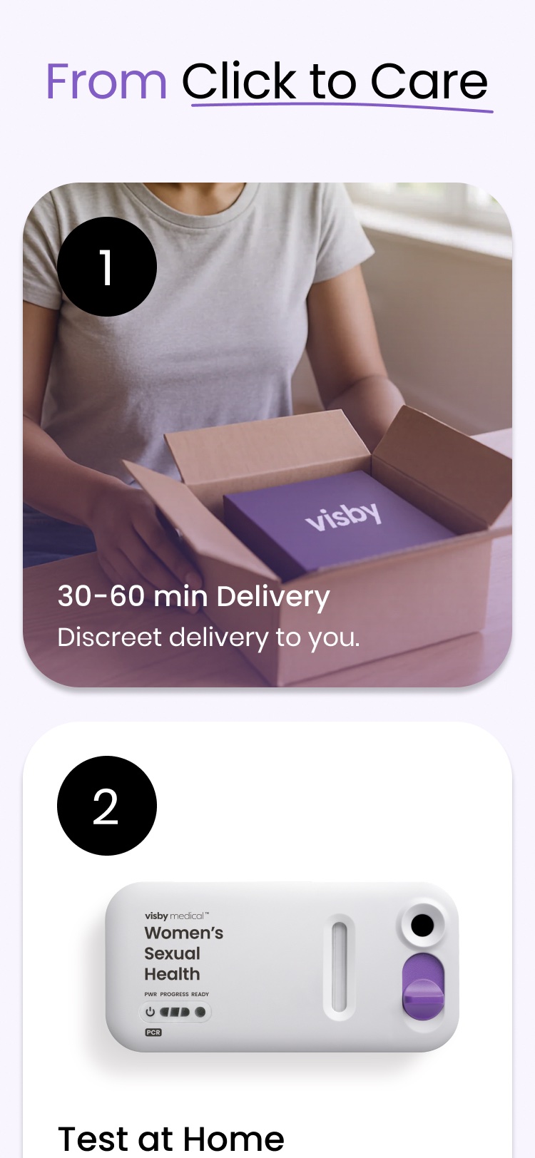
Four numbered steps, from click to care.
Delivery, testing, results and telehealth each get a card with a real photo. The purple results card stands out, because that’s the moment people care about most.
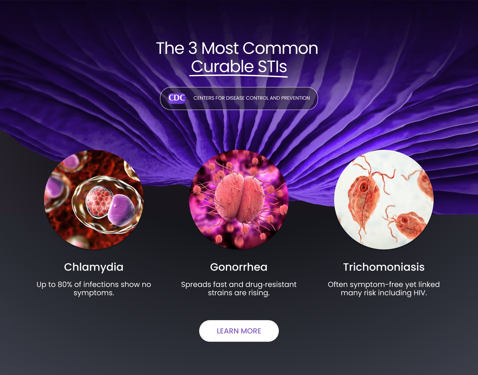
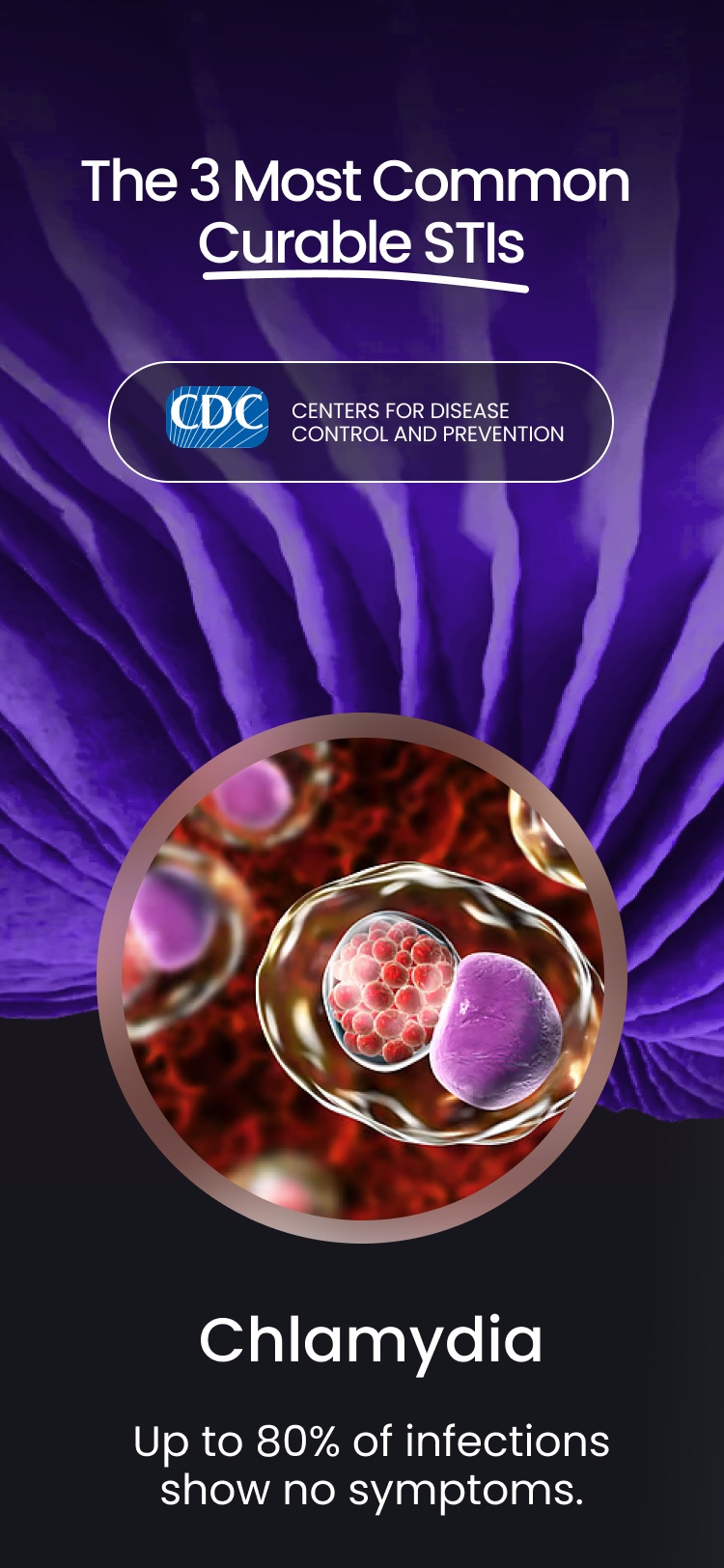
Education that makes testing feel urgent, not scary.
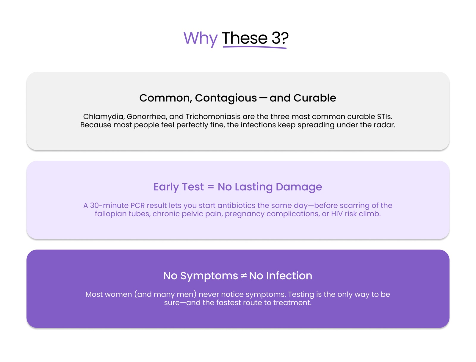
A dark, cinematic band introduces the three infections with CDC backing. Below it, three stacked cards move from facts to consequences to the key message: no symptoms doesn’t mean no infection.
Human proof alongside medical proof.
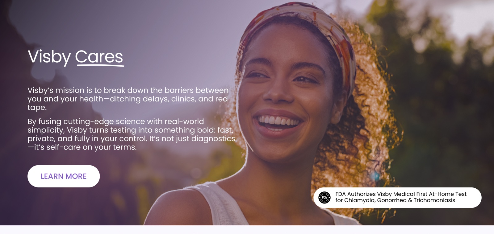
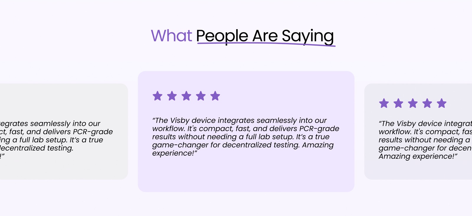
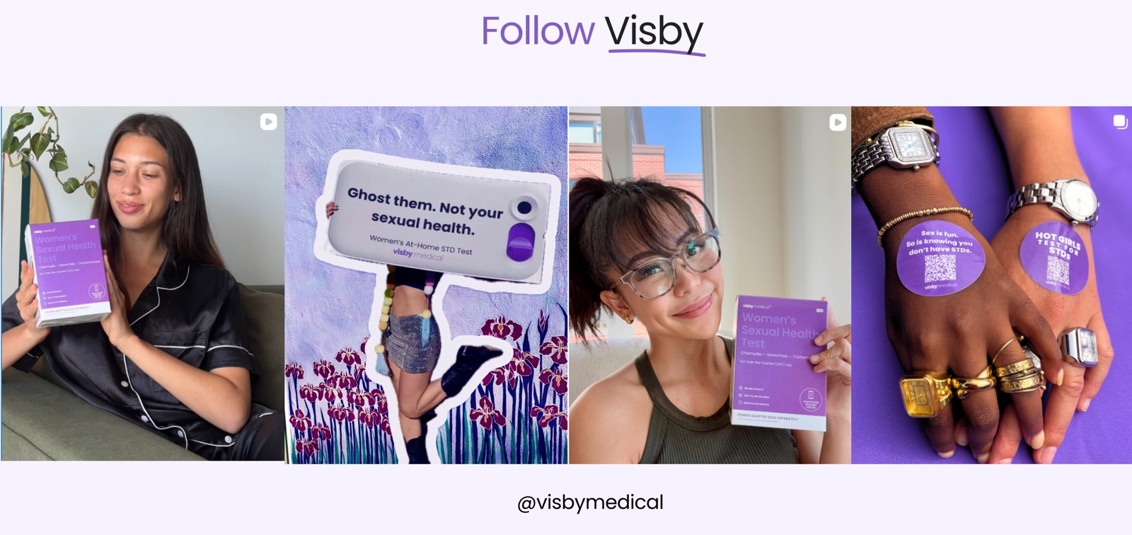
The mission statement, the FDA news badge, reviews and a real Instagram feed show the brand is warm, approved and used by real people.
Support first, then a confident call to action.
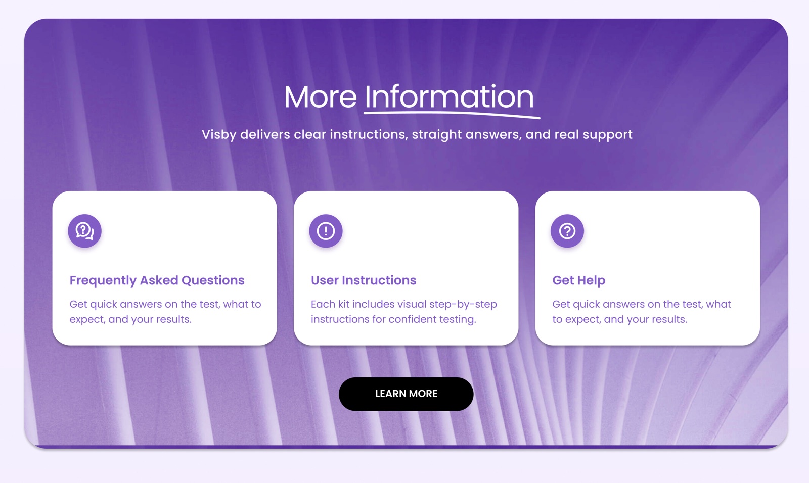
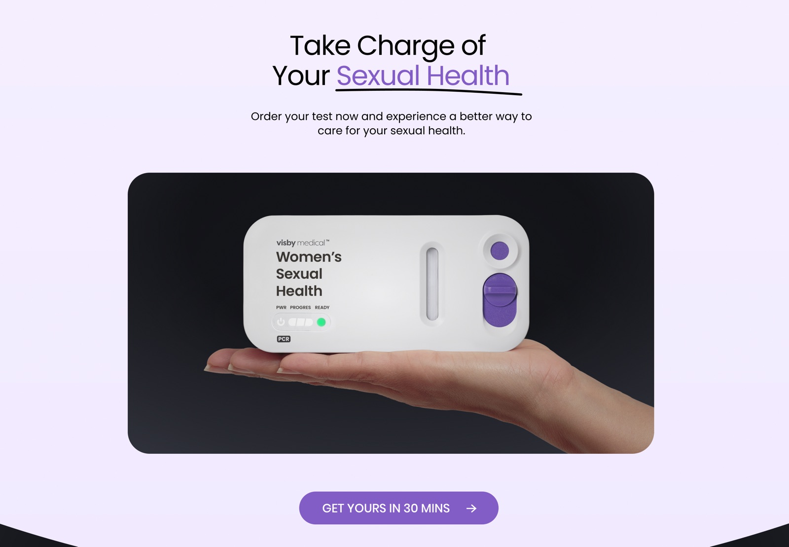
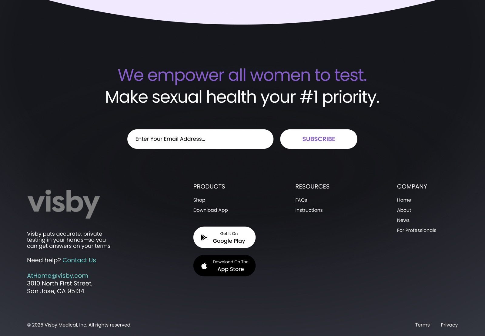
FAQs, instructions and help sit one tap away for anyone still unsure. The page then closes with the device in hand and a single “Get yours in 30 mins” action.
Built for the phone in her hand.
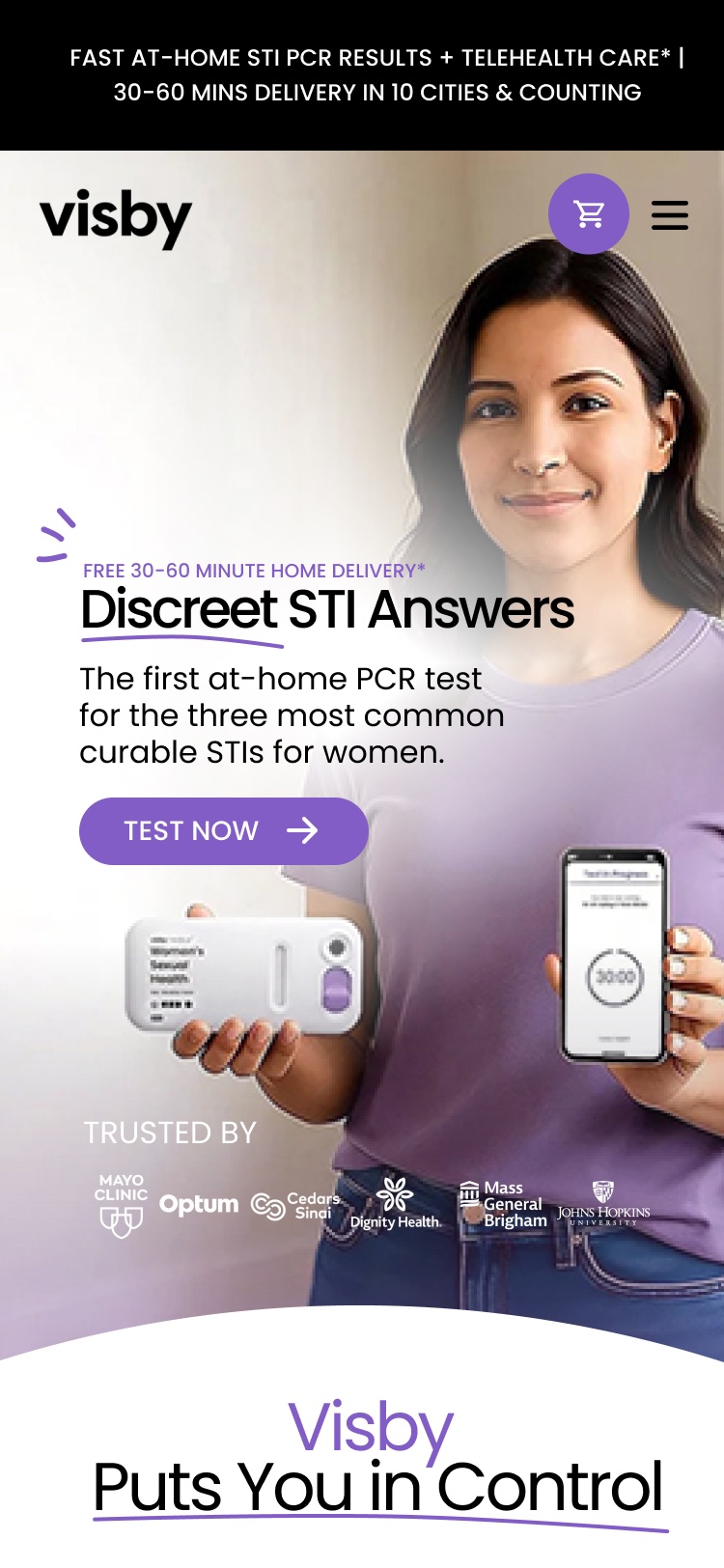
Most visitors arrive on mobile, often in private moments. Sections stack into a single column, step cards go full width and buttons stay within thumb reach.
Soft, confident and unmistakably Visby.
One purple carries the brand, lilac tints keep sections gentle, and a deep night tone adds weight to the educational moments.
Visby Purple#835DC6
Lilac#EFE7FF
Warm White#F6F5F1
Night#16171C
Ink#000000
From Click to Care
Two-tone headlines with a hand-drawn purple underline give every section the same friendly signature.
Pill buttons in uppercase: solid purple for the main action, white or lilac for secondary ones.