 Mehtab Hussain
From Instagram DMs to a store customers trust
Designing a mobile-first, Cash on Delivery fashion store for Fashion Lifetime, a Lahore brand selling jewellery, handmade Qureshia and clothing.
- Role
- Business owner · UX/UI Designer
- Service
- UX Research · UI Design · Design System · Prototype
- Platform
- Mobile-first responsive website, launching on Shopify
- Tools
- Figma · Coded prototype · Google Forms · Shopify
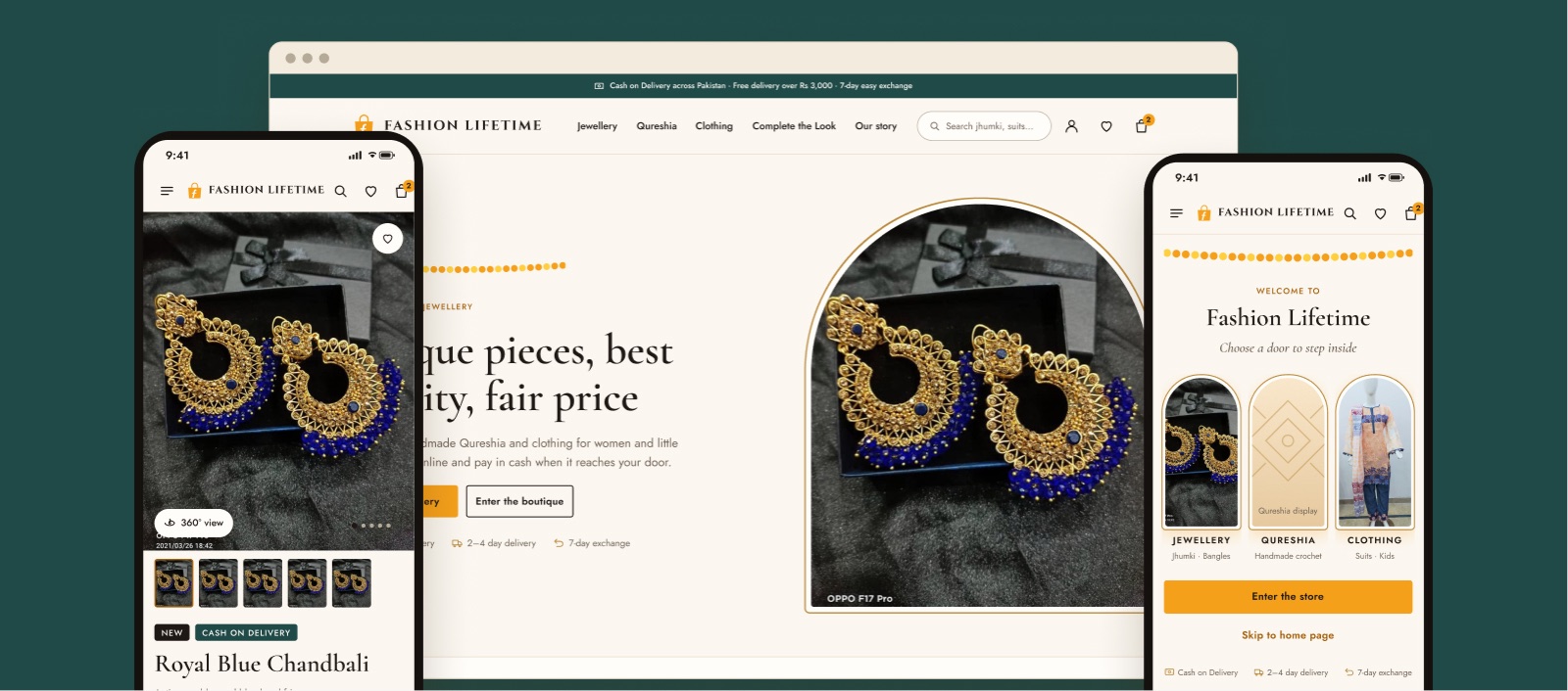
A boutique store for a brand that only sold through DMs.
Fashion Lifetime is my own Lahore business. Every sale started with a “price?” message and ended in a manual WhatsApp chat. With about 2.2K followers across three social channels, there was no single place to buy.
Products are scattered across posts and stories that disappear in 24 hours. Customers can’t filter by type, price or size, so they ask, and many never come back.
A page-only shop looks like any other Instagram seller. With no delivery promise, exchange policy or reviews, new customers hesitate to pay.
Price, stock, address and Cash on Delivery confirmation all happen by hand on WhatsApp. Replies slow down at busy times and orders get lost.
…let women aged 20–55 in Pakistan’s major cities browse everything, trust the brand and order with Cash on Delivery in a few taps, instead of DMing for prices and waiting for replies?
Nobody combined boutique charm with big-brand trust.
I combined what I knew from years of DMs and orders with a desk review of competitors and a survey of followers.
Trusted, but generic
Easy checkout and clear policies, but the same products everyone else is wearing.
Choice, but no personality
Huge catalogues with mixed quality, where a small brand gets lost among thousands of sellers.
Unique, but hard to trust
Personal and distinctive, but buying means DMs, waiting and paying an unknown page.
Unique and trustworthy
Fashion Lifetime’s opportunity: boutique pieces with the trust signals of a big store, namely COD, real photos and a clear exchange policy.
Three people the store has to work for.
Customers are 20–55, about 90% women, in major cities, on a medium budget and mostly on mid-range Android phones.
Ayesha, 27
Marketing executive · Lahore“I lose pieces I like in stories, and I hate DMing for prices.”
Nadia, 44
Homemaker · Karachi“I don’t pay an unknown page in advance. Cash on delivery or nothing.”
Hamza, 31
Engineer · Islamabad · gift buyer“I never know what goes together, and it has to arrive before Eid.”
Proto-personas built from owner knowledge and DM patterns, then checked against the survey and usability sessions.
The biggest drop-off was the “ask” step.
Ayesha buying earrings for a mehndi, today and with the new store. Every step that depended on a DM became an answer on the page.
Unique to look at, simple to buy.
Three ideas, each mapped to a goal. I also tested a full 3D walk-through store and rejected it: too heavy for mid-range Android phones on mobile data, and hard to make accessible.
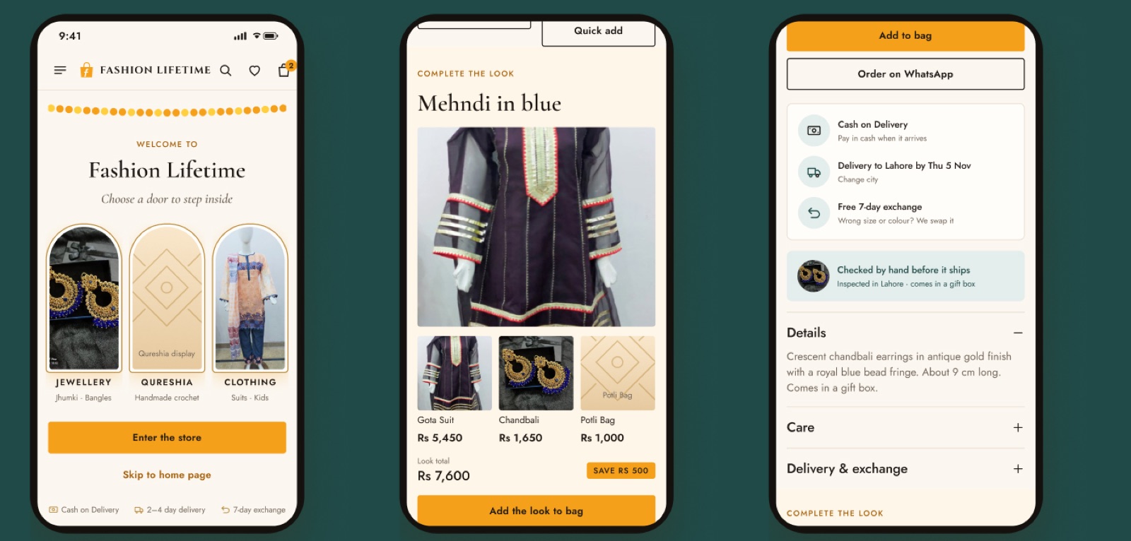
Boutique entrance
A 2–3 second branded intro opens onto three arch doors: Jewellery, Qureshia and Clothing. It’s light, skippable and keyboard-friendly.
Complete the Look
A matching suit, jewellery and potli shown together, with a bundle total and one “Add the look” button that saves Rs 500.
Handmade trust
Cash on Delivery, a delivery date for your city, a 7-day exchange, real reviews and WhatsApp help, right under Add to bag.
Answer every DM question on the product page.
I wireframed 12 mobile screens in greyscale to test layout and priority before colour. The product page changed least: the structure was right, and the trust details just needed visual weight.
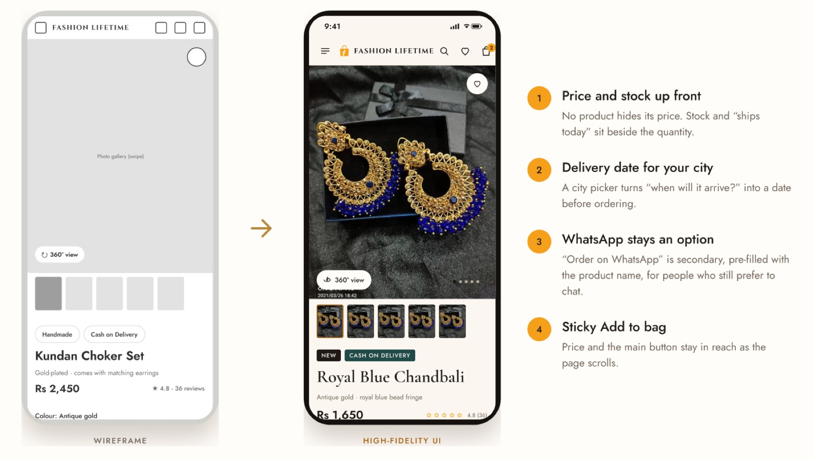
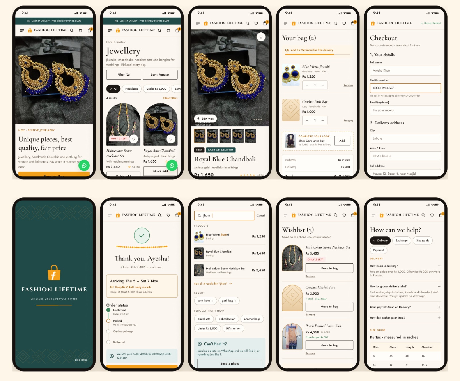
Every flow designed for one thumb.
Most customers arrive from Instagram on a phone, so every flow was designed at 390 px first. Touch targets are 44–48 px and text meets WCAG AA contrast.
Complete the Look turns one item into an outfit.
The three categories finally connect: a suit, matching jewellery and a handmade potli, added in one tap with a Rs 500 bundle saving that the bag applies automatically.
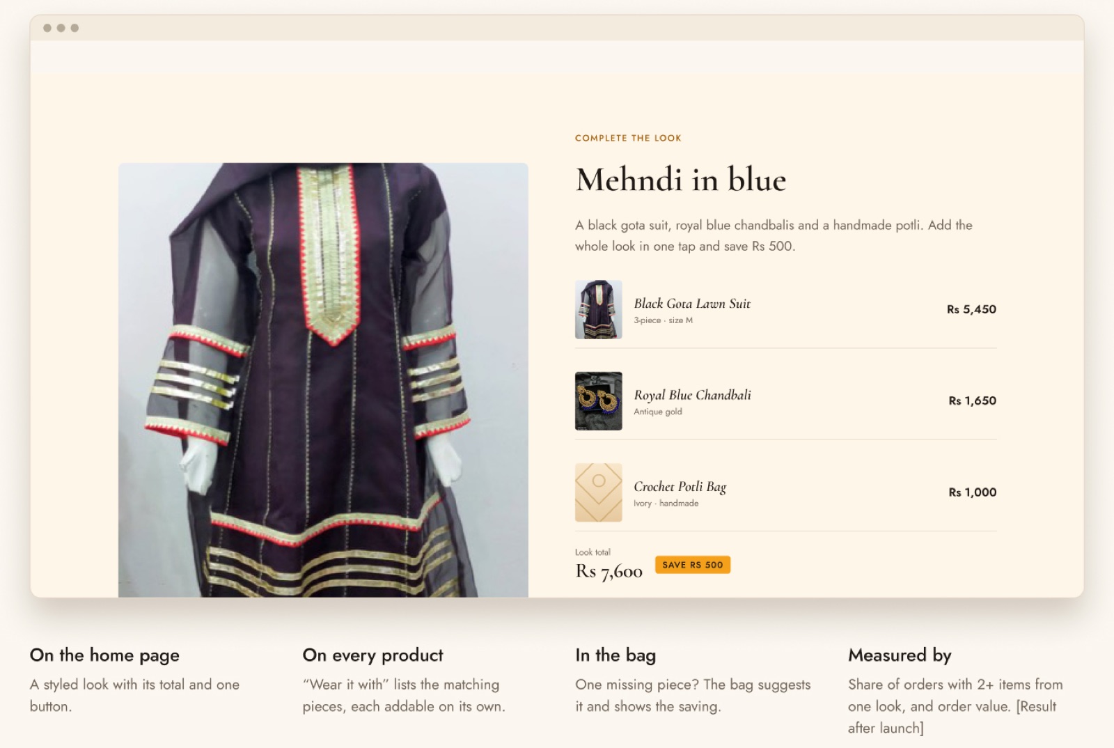
A styled look with its total and one button.
“Wear it with” lists the matching pieces, each addable on its own.
One missing piece? The bag suggests it and shows the saving.
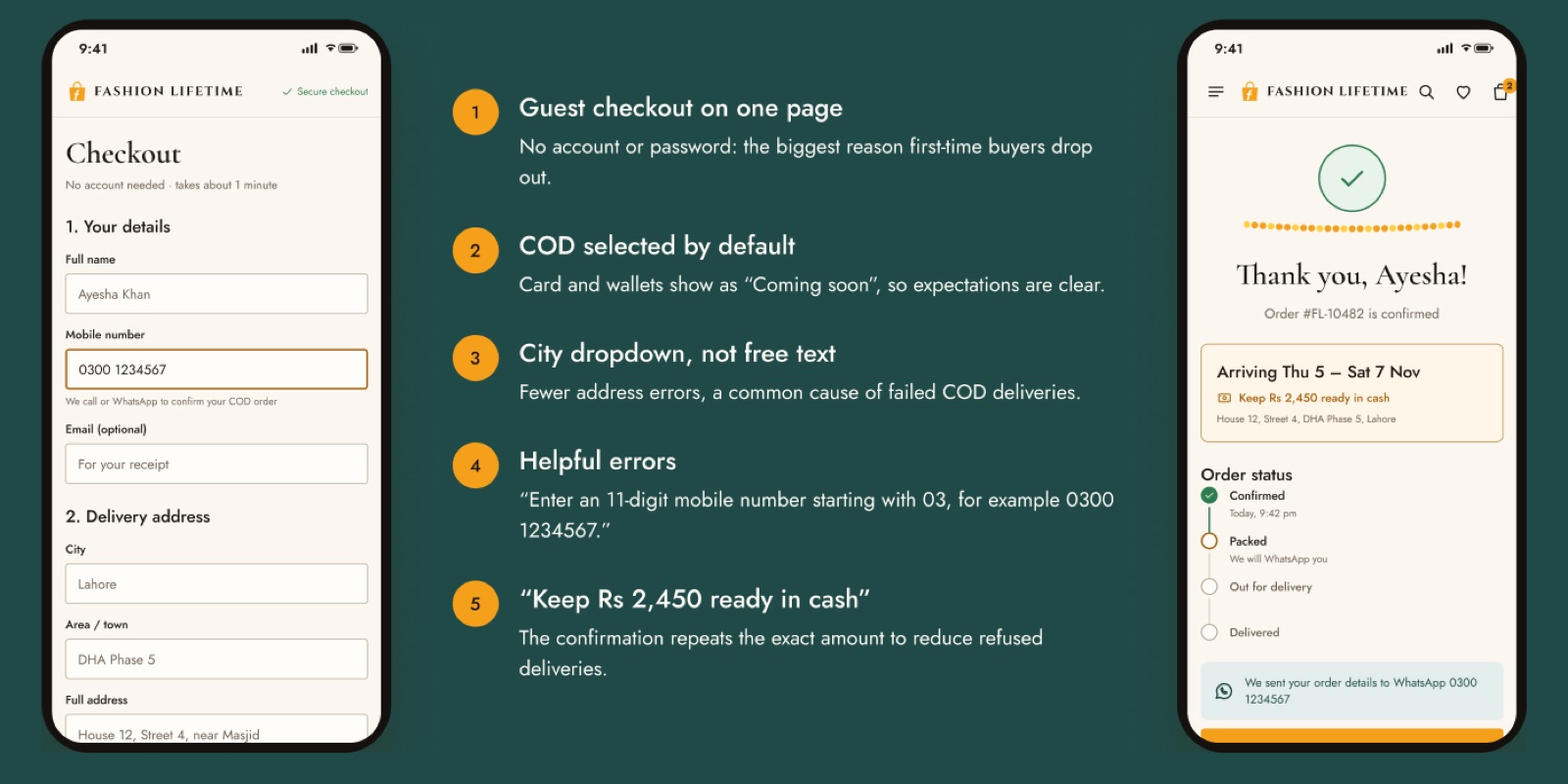
Cash on Delivery, by default.
Most customers pay in cash at the door, so checkout is built around it: one page, no account, and the exact cash amount repeated after ordering.
The same system, scaled to a 1200 px grid.
Nine desktop pages share every component with mobile. Product, bag and checkout become two columns, with the buy box or order summary always in view.
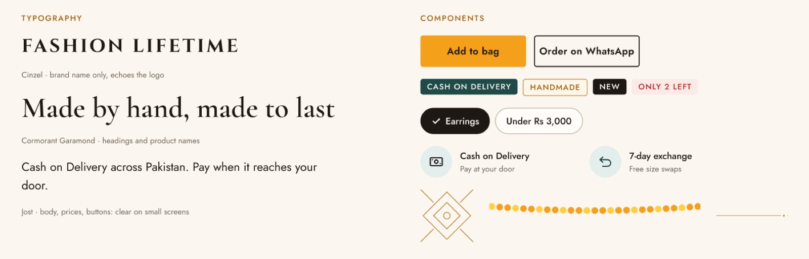
Light luxury with Desi heritage details.
Cream surfaces keep it premium and photo-friendly, while arches, jaali, marigold and brass make it unmistakably Pakistani.
Brand orange#F5A01A
Text orange#A4600A
Heritage teal#1F4A47
Brass#B8893C
Cream#FBF7F0
Ink#1E1814
A working store, tested with real customers.
I built a clickable prototype that runs as a phone app and a desktop website, with real product photos, Complete the Look, a 360° view and a working COD checkout. Five participants matching the personas used it on their own phones.
- Moderated sessions, 20 minutes each
- Five participants matching the three personas
- Single ease question after every task
- System Usability Scale (SUS) questionnaire at the end
Each finding is paired with the design change it leads to, before the Shopify build starts.
What I learned, and what ships next.
Trust is a feature, not a footer
COD, delivery dates and the exchange policy work best right next to the button, where the doubt happens.
Unique doesn’t mean heavy
A light 2.5D entrance gave the boutique feeling without the cost of a 3D store on mobile data.
Photos are part of the UX
Watermarks, text on photos and mixed backgrounds hurt trust. A simple photo guideline is now part of the system.
Start with assumptions, then test
Proto-personas let me move fast; the survey and sessions are there to confirm or change them.
- 01
Fix
Apply usability findings.
- 02
Photograph
Plain background, no text, same angles.
- 03
Build
Shopify theme from this design system.
- 04
Connect
COD, courier and WhatsApp alerts.
- 05
Launch
Announce on Instagram, Facebook and WhatsApp.
- 06
Measure
Conversion, look orders, orders without a DM.