Mehtab Hussain
SelfPOS: buy and finance a car without the dealership desk
Designing a self point-of-sale web app where buyers find a car, build it, compare purchase, finance and lease prices, and complete the whole application online.
- Role
- UI UX Designer
- Service
- UX Design · Web App Design · Design System
- Platform
- Responsive web app, desktop first
- Tools
- Figma
Car buying online usually stops at the finance office.
Shoppers can browse cars on most dealer sites, but pricing, financing, insurance and paperwork still happen in person. SelfPOS brings every one of those steps onto the screen.
Let a buyer go from “just looking” to a signed finance application in one sitting, without a salesperson, while always knowing what they will pay each month.
- Monthly prices are hidden until late in the process
- Comparing purchase, finance and lease means asking a dealer
- Configuring a car and pricing it live in separate places
- Insurance, ID and income documents are handled on paper
Make a long, regulated finance process feel as simple as online shopping.
One path from browsing to signing.
Every screen answers the buyer’s next question and keeps the price in view, so the flow never stalls on “what will this cost me?”.
- 01
Discover
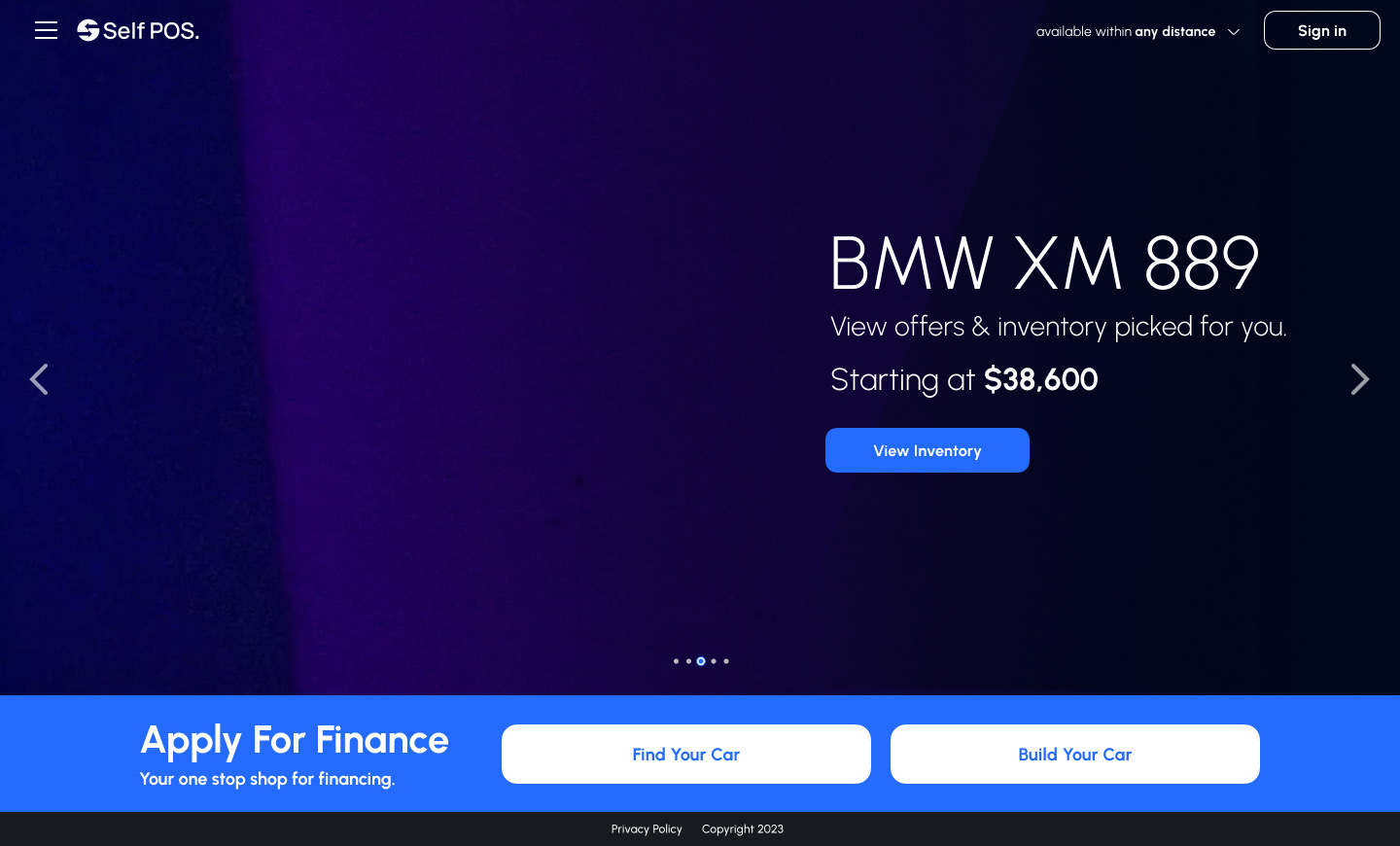
Hero offers, guided search and inventory filters.
- 02
Evaluate
Vehicle details, 360° view and side-by-side compare.
- 03
Build
Colour, wheels, interior and packages with live pricing.
- 04
Apply
Insurance, delivery, applicant info and documents.
- 05
Sign
E-sign and submit, with help and FAQs on hand.
Start with what the buyer can afford.
The first question is about budget and payment type, not make and model, so every result that follows already fits.
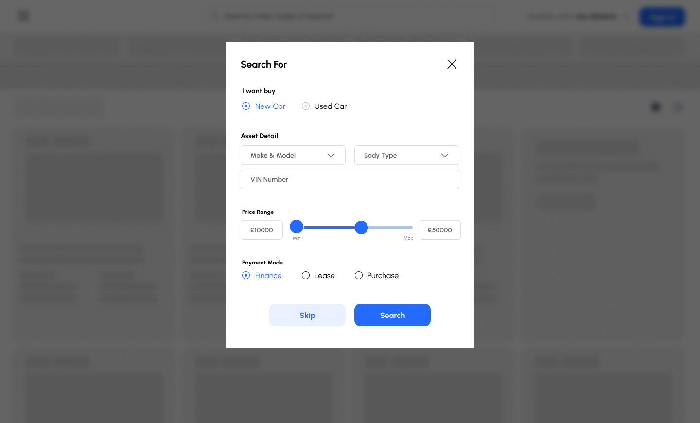
Three questions before the first result.
New or used, price range and payment mode (finance, lease or purchase) narrow 47,000+ listings to the cars that match. Skip is always there for people who just want to browse.
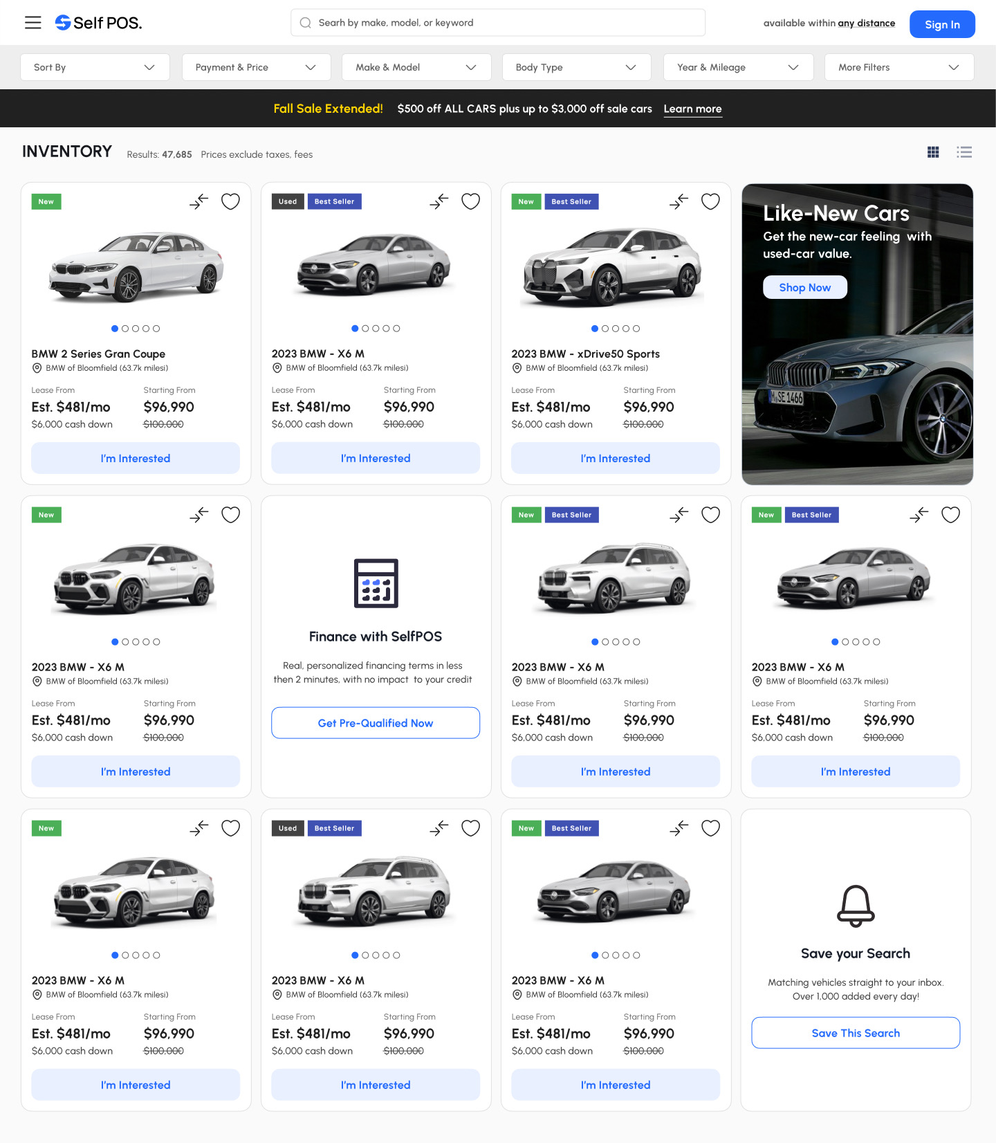
The monthly price on every card.
Each car shows the lease estimate and the purchase price together, with New, Used and Best Seller tags. Compare and save sit on the card, and promo tiles for pre-qualification and saved searches are mixed into the grid.
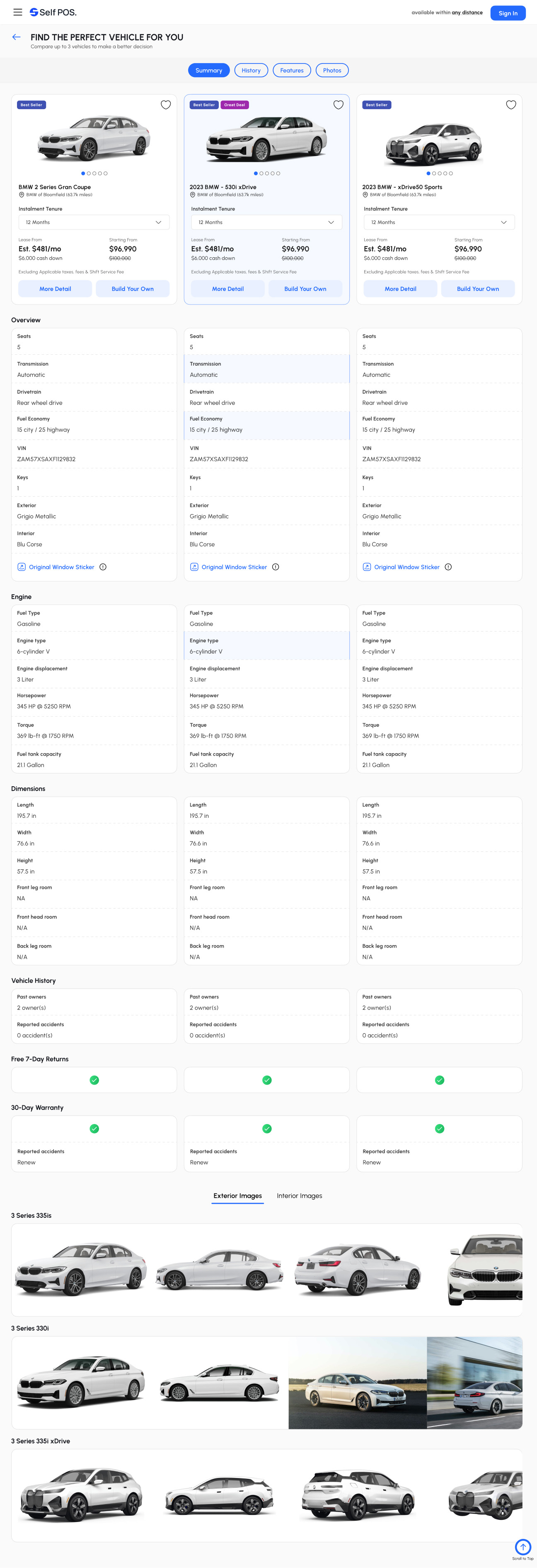
Detail and comparison without a test-drive desk.
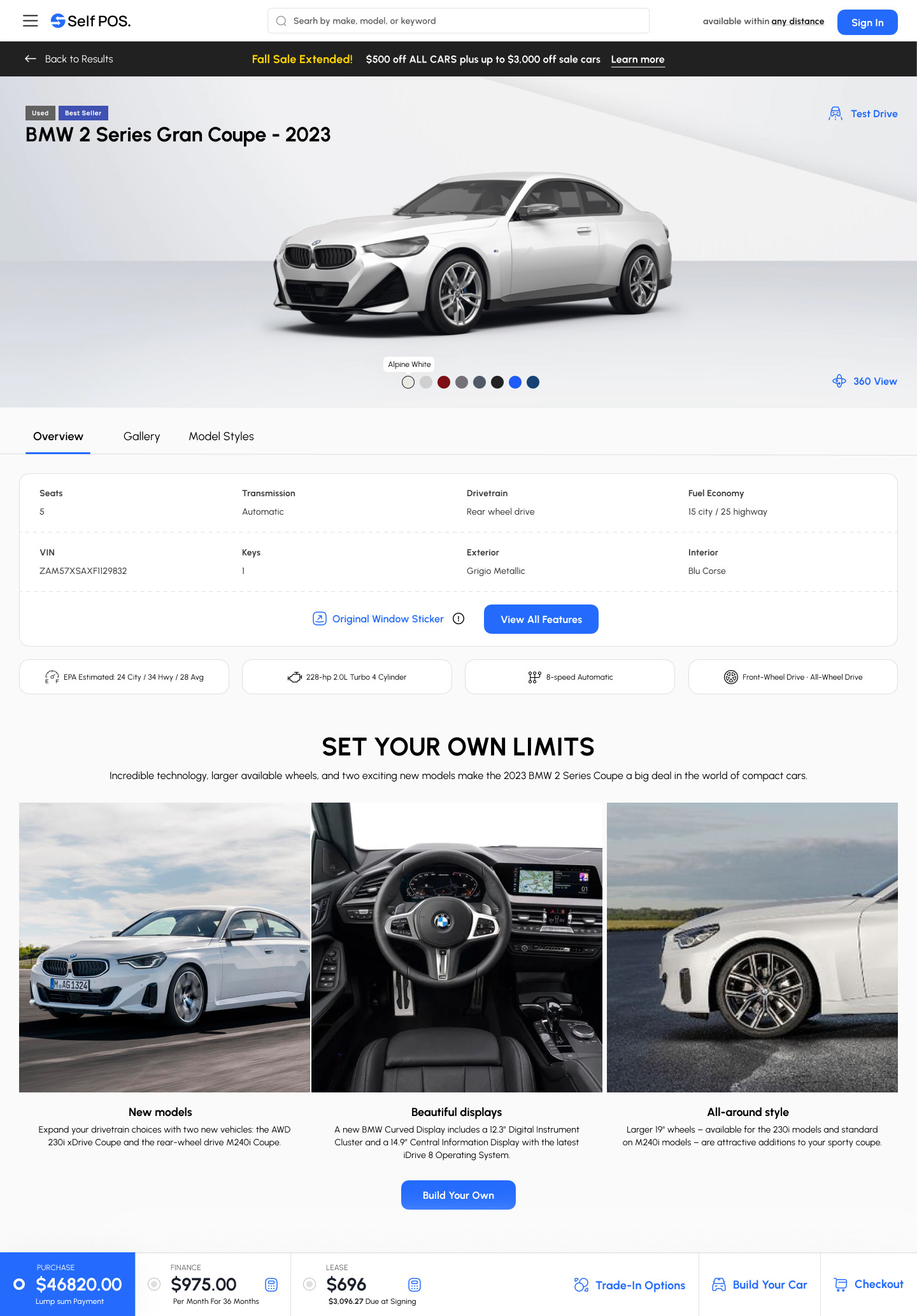
The vehicle page answers the spec questions up front, and the payment bar at the bottom follows the buyer through every step that comes after.
Configure the car and the deal together.
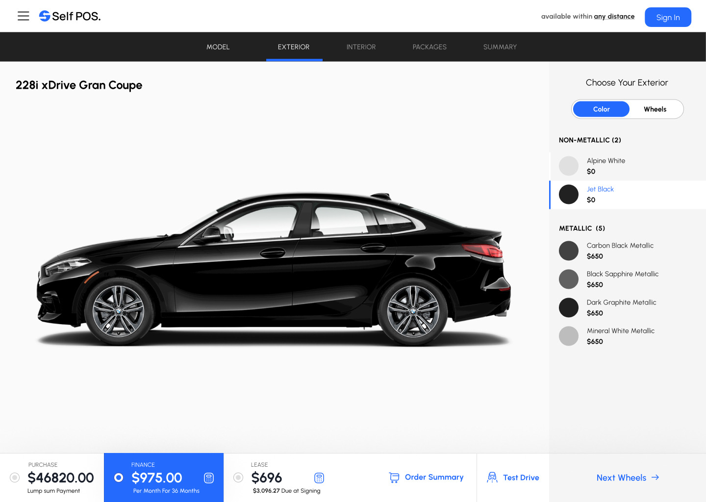
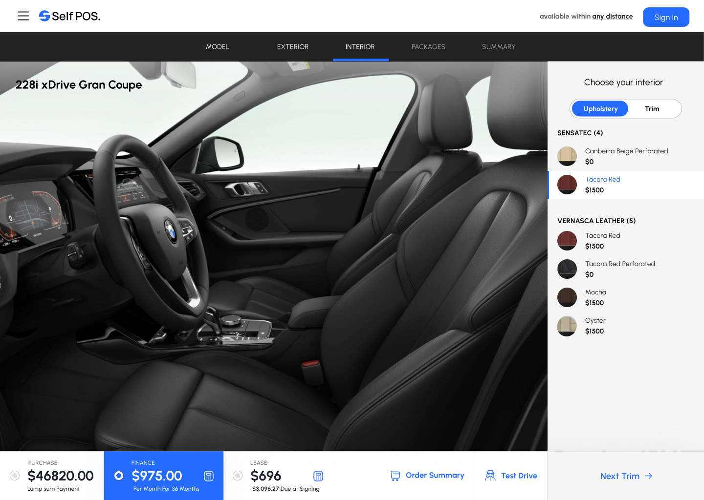
Every option shows its price, and the bar at the bottom updates purchase, finance and lease totals as the buyer changes colour, wheels, interior or packages.
Model, exterior, interior, packages, summary.
A tab bar shows where the buyer is and what is left. Choices sit in a right-hand panel grouped by type (non-metallic, metallic, upholstery, trim) so the car stays large on screen.
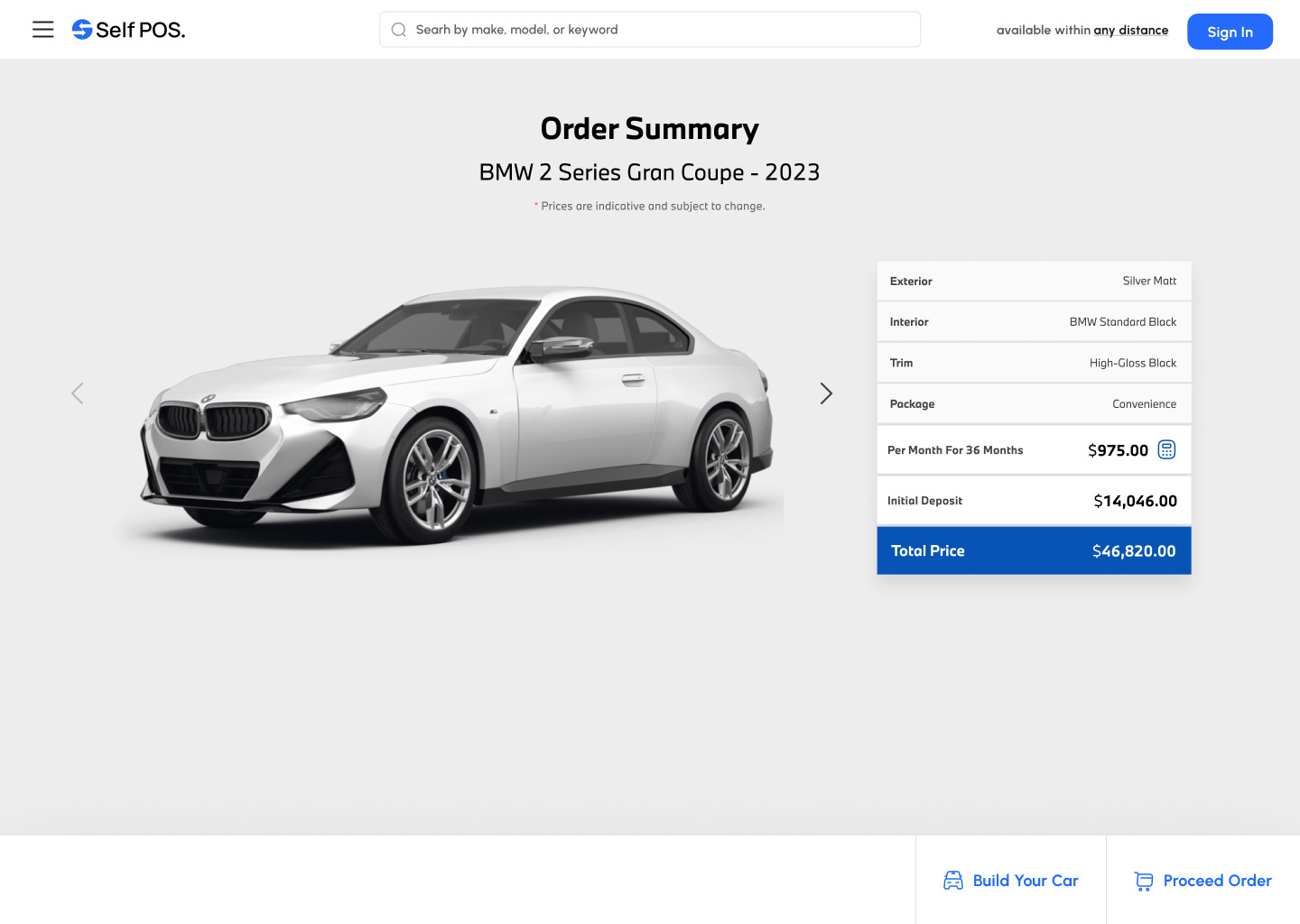
Three prices, always in view.
Purchase, finance per month and lease due at signing sit side by side. The selected option is highlighted, with Order Summary and Test Drive one click away.
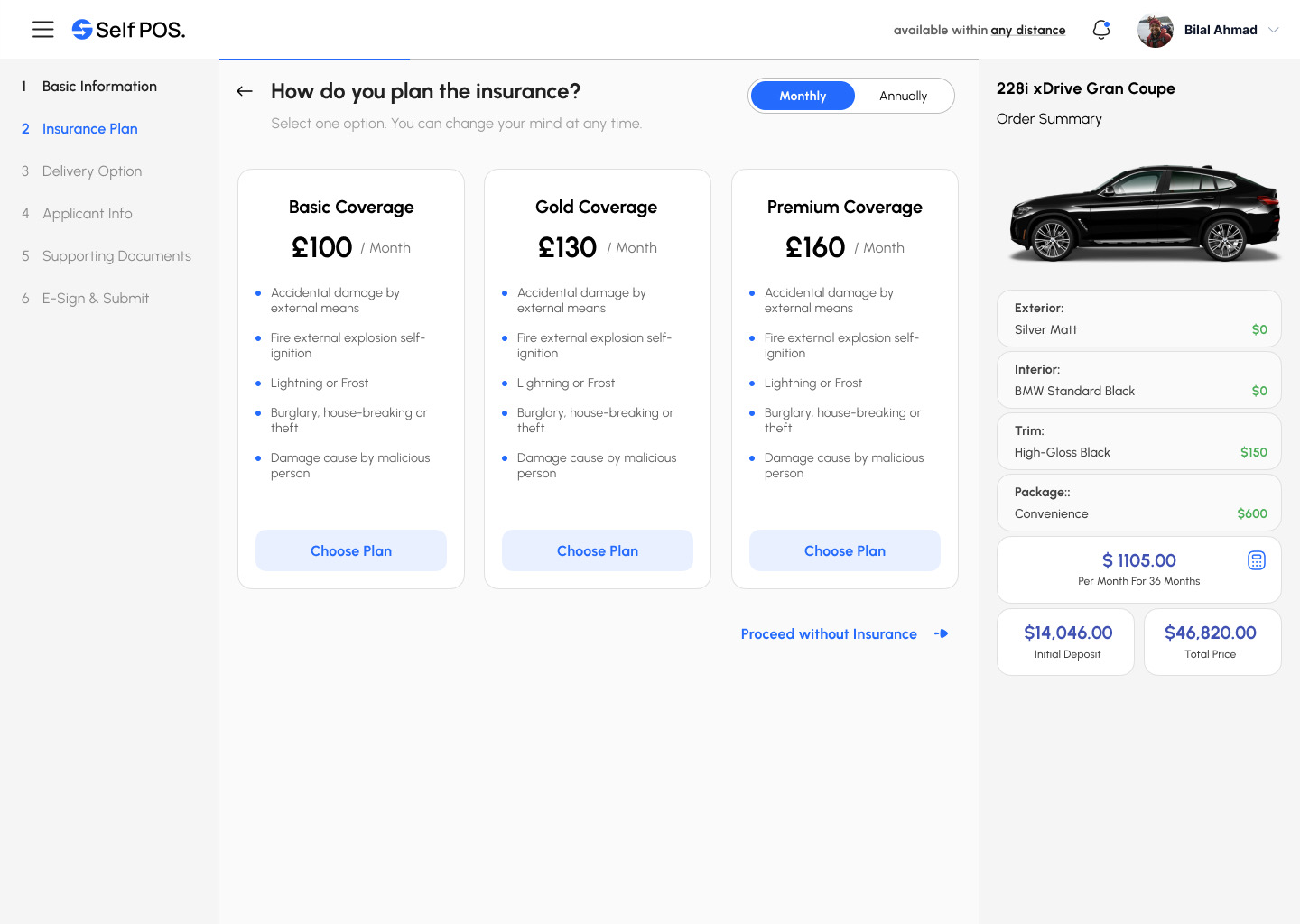
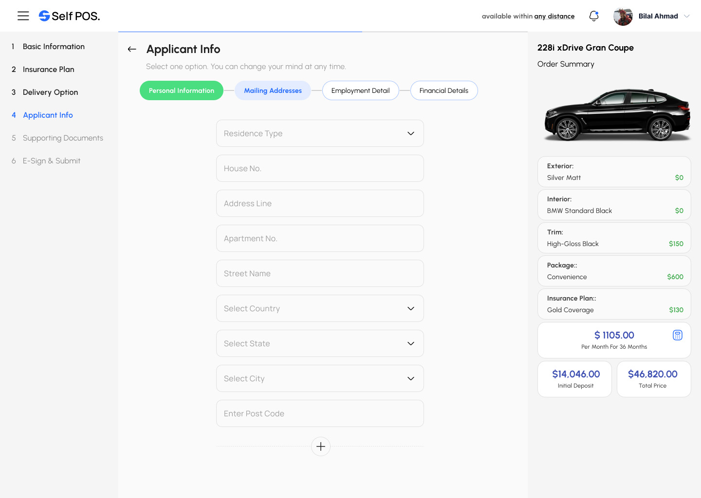
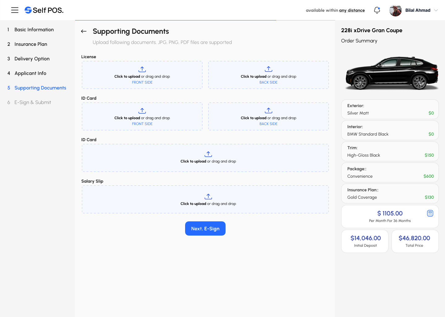
A six-step application with the deal always beside it.
A numbered side menu shows the whole application, and the order summary stays on the right so the buyer never loses sight of what they are signing up for.
Clear choices
Insurance plans as three comparable cards with monthly and annual pricing, plus a visible “proceed without insurance”.
Chunked forms
Applicant info is split into personal, address, employment and financial tabs instead of one long form.
Drag-and-drop documents
Licence, ID and salary slip uploads with front and back slots, so nothing is missed before e-sign.
Thirteen screens, one flow.
From the home page and sign-in to the last document upload and the help centre. Open any screen to see it in full.
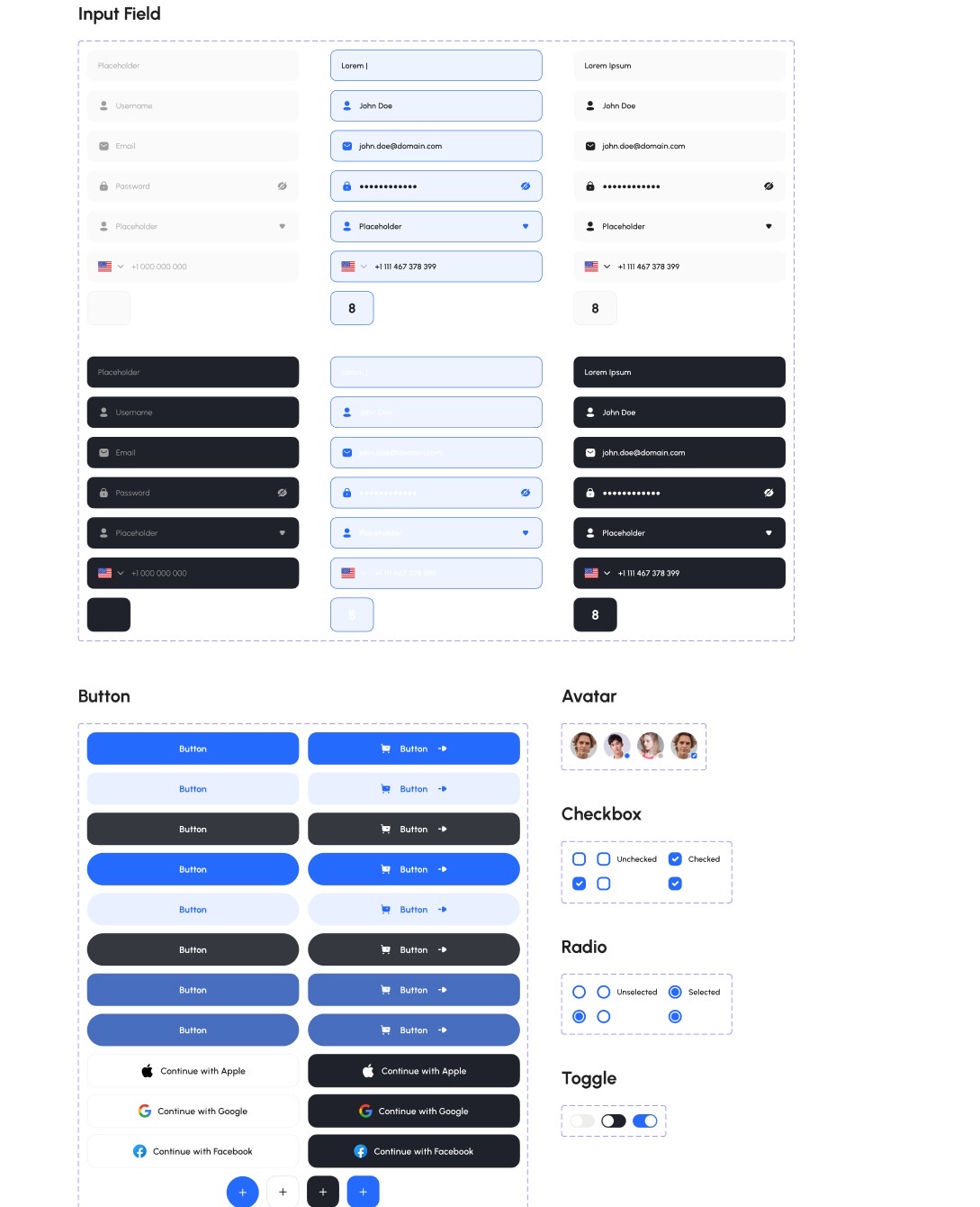
Confident blue, quiet greys, clear status.
One primary blue carries every action, a yellow secondary highlights offers, and a full greyscale keeps dense finance screens calm. Urbanist in four weights covers headings to captions.
Primary#246BFD
Secondary#FFD300
Success#4ADE80
Warning#FACC15
Error#F75555
Grey 900#212121
Dark 1#181A20