
All work Mehtab Hussain
Case studyFintechMobile app

Mobile Wallet App UX Case Study

Redesigning a leading mobile wallet in Pakistan to be intuitive, efficient and inclusive for everyone, from first-time users to tech-savvy professionals.

Role
UX Researcher & Mobile App Designer
Service
UX Design · Visual Design · Design System
Team & duration
5 designers · 1 year
Tools
Figma, Photoshop, Miro, Google Sheets & Docs

Note: This is a personal UX case study created to demonstrate my design process. All branding, visuals and flows are modified to respect NDA constraints.

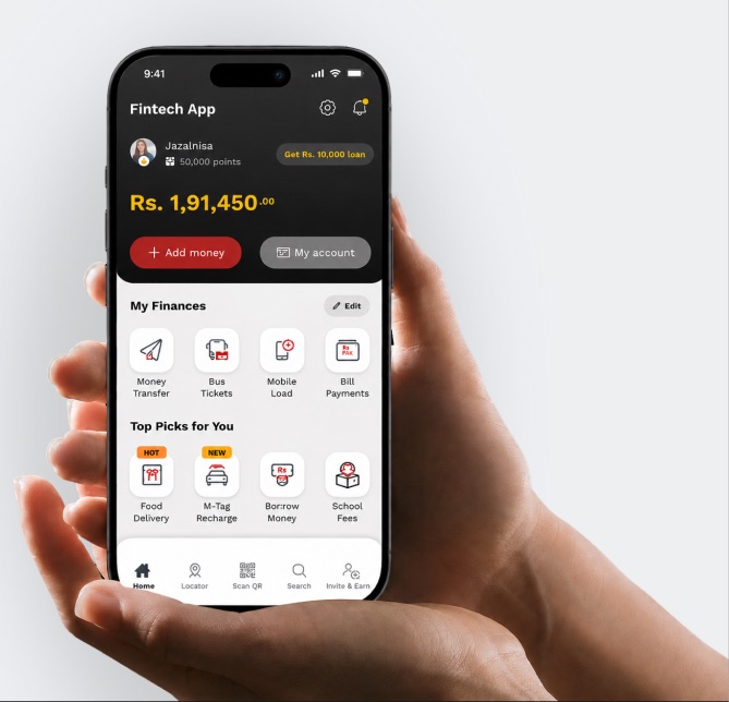
Redesigned wallet home screen showing balance, My Finances shortcuts and Top Picks

I uncover the real user problems before designing the solution.

Introduction & goal

A leading mobile wallet app in Pakistan was facing usability challenges. Users struggled with navigation, completing transactions and understanding key features.

The goal: redesign the app experience to make it more intuitive, efficient and inclusive for all user types, including first-time users and tech-savvy professionals.

Problem
  • Challenges with usability and user adoption
  • Complex interface and unclear navigation
  • Users with low digital literacy struggled with core flows
  • The existing app didn’t scale well for future features
Challenge

Create a clean, accessible and future-proof mobile wallet experience.

Market size60M+
Active users29.2M
Average growth57.8% YoYPKR 50–65 trillion annual GTV by 2030
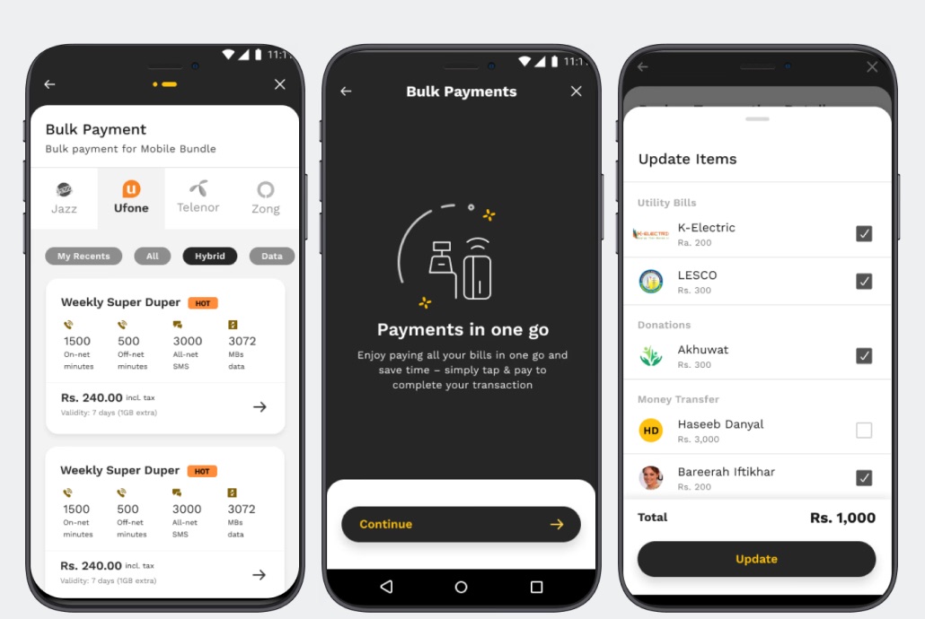
Bulk payments flow: choosing a mobile bundle, the Payments in one go intro, and selecting bills to pay together
Final UI · Bulk payments: pay bundles, utility bills, donations and transfers in one go.
Design process

Design thinking methodology.

  1. 01

    Empathize

    Interviews, surveys and competitor research.

  2. 02

    Define

    Personas, pain points and needs.

  3. 03

    Ideate

    Affinity mapping and feature jamming.

  4. 04

    Design

    Wireframes, UI and the design system.

  5. 05

    Test

    Validate flows and iterate.

User research

How we found out the problem.

By empathising with our users through different UX techniques, we figured out their pain points.

Target audienceOlder people who can’t read and writeTech-savvy peopleWorking people

Tech-savvy professional

Software Engineer
Age27
StatusSingle
OccupationSoftware Engineer
Behaviour
  • Uses a mobile wallet regularly for money transfers, bill payments and mobile top-ups
  • Appreciates a clean, user-friendly interface
  • Wants control over personal finance
  • Expects a secure, reliable app with customisation and flexibility in settings
Goals
  • Complete transactions quickly with minimal steps
  • Clearly understand fees and charges before confirming
  • Track spending and transaction history
  • Quickly resolve failed or pending transactions
  • Have all essential financial services in one place
Frustrations
  • Too many steps to complete simple transactions
  • Confusing navigation and unclear labels
  • Unexpected or poorly explained fees
  • Pending or failed transactions with no clear reason
  • Important information hidden behind multiple screens
  • Limited guidance when something goes wrong

Ikram

Elderly citizen
Age60
StatusMarried
OccupationRetired
EducationHigh School Diploma
Goals
  • Easily transfer money to family and friends
  • Top up phone credit without going out
  • Pay bills without leaving home
  • Avoid carrying physical cash for safety reasons
Frustrations
  • Complicated and confusing app interface
  • Difficulties with app usage and navigation
  • Hidden fees and charges
  • Unhelpful and inaccessible customer support

Sarah

Working mother
Age42
StatusMarried
OccupationSales Manager
EducationBachelor’s in Marketing
Behaviour
  • Uses a mobile wallet to manage family expenses and bills
  • Wants her money to be safe and secure
  • Needs a user-friendly interface for a busy lifestyle
  • Values transparency in fees and a wide range of merchants
Goals
  • Keep track of family spending and expenses
  • Pay bills without leaving the house
  • Top up phone credit anytime, anywhere
  • Save time on daily transactions
Frustrations
  • Limited merchants for mobile top-up and bill payments
  • Complicated app navigation
  • Hidden fees and charges
  • Unreliable and insecure wallet apps
Competitor analysis

Mapping the market early.

Competitive analysis helped us understand other wallets and banking apps, and map where each stands on user experience and features.

Quantitative research

What wallet users told us.

We surveyed mobile wallet users to validate interview findings with numbers.

What is the main reason you use a financial or wallet app?

  • Mobile top-ups40%
  • Pay bills30%
  • Money transfer20%
  • Saving10%

What concerns do you have, if any, about using financial apps?

  • Privacy & data sharing33%
  • Accessibility & usability30%
  • Security & fraud risk22%
  • Hidden fees15%

What services do you use most?

  • Receiving money from others33%
  • Loan services25%
  • Transfers to bank accounts20%
  • Government fees, taxes, challans17%
  • QR payments at shops5%
Affinity mapping

From raw answers to clear themes.

Based on the interview and survey answers, we drew insights, brainstormed as a team and organised them into an affinity diagram.

Challenges and pains
Delays in payment confirmation
High cash-out charges discourage frequent use
Cluttered and confusing app interface
Difficult to locate transaction history and receipts
Linking bank accounts isn’t smooth, leading to trust issues
App consumes a lot of battery and data
Limited customer support and slow issue resolution
Transaction errors aren’t explained clearly
User needs
Fast and reliable transaction confirmations
Transparent and affordable transaction fees
Simple, intuitive and clean navigation
Easy access to transaction history and receipts
Strong security (biometric login, fraud protection)
Trust-building measures for linking bank accounts
Quick and responsive customer support
More personalisation (favourites, saved transactions)
Subscriptions that extend automatically
User behaviour
Frequently use the wallet for mobile top-ups and bill payments
Many prefer it for easy cash-in / cash-out at agents
Check for cashback offers and promotions before paying
Some rely on it as their primary financial tool (unbanked users)
Younger users engage with QR payments and online shopping
Users compare it with Easypaisa and other wallet apps
Suggestions
Improve transaction speed with real-time status updates
Redesign UI/UX for simplicity and clarity
Tiered loyalty programmes (cashback, discounts)
Detailed error messages instead of a generic “failed transaction”
Lower or restructure cash-out charges
In-app live chat and faster complaint resolution
Budgeting and spending insights
Better onboarding to build trust (tutorials, security guarantees)
Optimise performance to reduce battery and data use
Feature jamming

Turning needs into features.

A collaborative feature jamming session generated features for the redesign, prioritised by user needs, feedback and competitor analysis.

Home
Add Money
Notifications & Help
My Account
Latest Updates
Scan QR
Navigation bar
Home
Locator
Scan QR
Search
Invite
Tray menu
Money Transfer
  • Favourites
  • Bank
  • Wallet to wallet
  • CNIC
  • Other wallet
Utility Bills
  • Favourites
  • Electricity
  • Gas
  • Water
  • Internet
  • Telephone
Mobile Loads
  • Favourites
  • Prepaid
  • Postpaid
  • Mobile packages
Banking
  • ReadyCash
  • Health insurance
  • Debit card
  • Mutual funds
  • Savings plans
Travel
  • M-Tag
  • Careem
  • Bus ticket
Education
  • School expenses
  • College expenses
  • Coaching
  • Universities
  • Entry test
Entertainment
  • Daraz Wallet
  • E-voucher
Government Payments
  • NADRA
  • Corporate
  • Invite & earn
Other
  • Traffic challan
  • Govt payments
Wireframes

Structure before style.

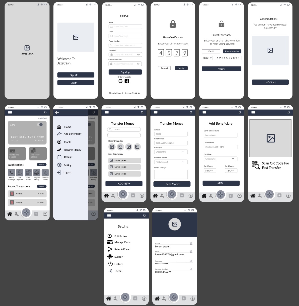
Onboarding, sign-up and verification, home, menu, money transfer, beneficiaries, QR scanning, settings and profile, mapped out in low fidelity first.

Low-fidelity wireframes of onboarding, sign up, phone verification, password reset, home, side menu, transfer money, add beneficiary, QR scan, settings and profile screens
Design system

Building reliability through trust.

A shared system of colour, bilingual typography, elevation, layout rules and form components for iOS and Android.

Colour palette
Primary · Auburn#A22621
100908070605040302010
Secondary · Yellow#FFC20C
100908070605040302010
Greys#262626
100908070605040302010
iOS typography · English & Urdu
XL64
Large Title28 · Urdu 32
Title 124 · Urdu 28
Title 220 · Urdu 24
Headline16 · Urdu 20
Body · Subhead · Caption16 · 14 · 12

تو شاہیں ہے پرواز ہے کام تیرا

Android typography · Cocon & Work Sans
XL Title64 · Cocon
Headline 128
Headline 224
Headline 320
Subtitle16
Body 1 · Body 2 · Caption16 · 14 · 12 · Work Sans
Elevation · 5 levels
Level 0
Level 1
Level 2
Level 3
Level 4
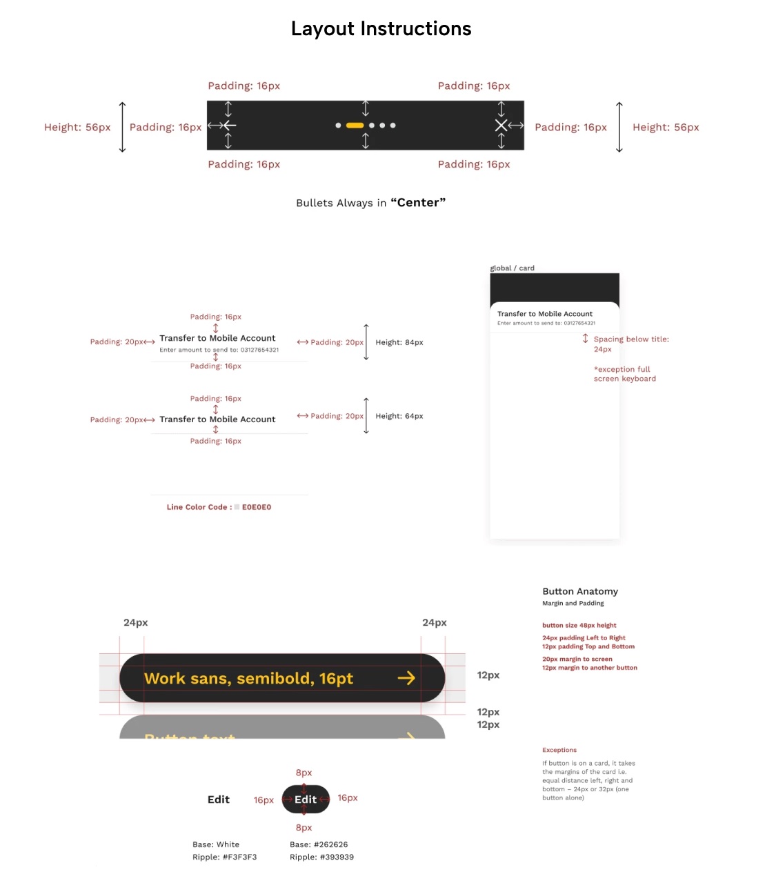
Layout specs: 56px header with 16px padding, list rows of 84px and 64px with 20px side padding, and button anatomy with 48px height, 24px horizontal padding and 12px vertical padding
Layout instructions and button anatomy.
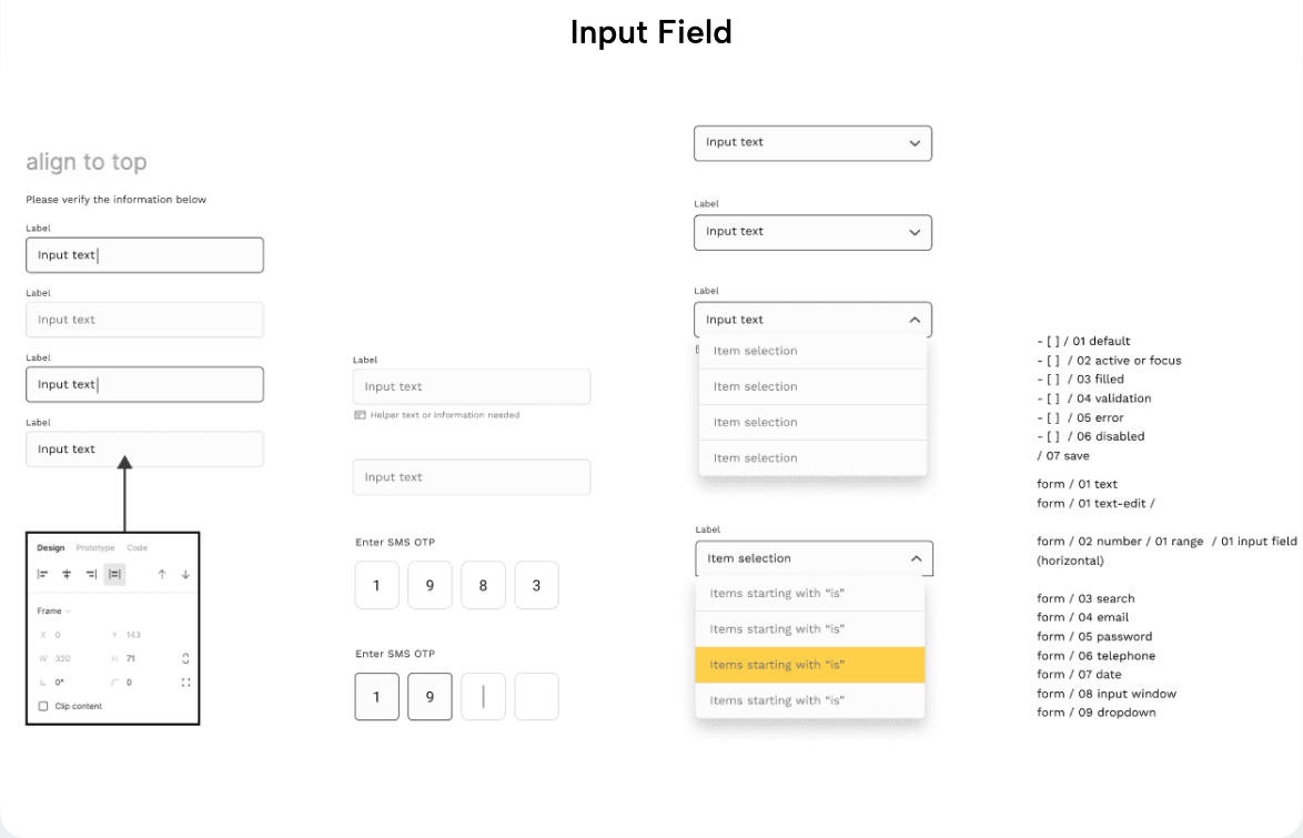
Input field states: default, focus, filled, validation, error and disabled, plus SMS OTP and dropdown components
Input fields: seven states, OTP entry and dropdowns.
Next case study At-Home STI Test Website