 Mehtab Hussain
KINETIQ: a 3D e-bike website, built by prompting Claude
KINETIQ is a concept e-bike shopping experience designed to explore how AI-assisted development can accelerate interactive product prototyping without replacing human design judgment.
As the solo designer, I defined the product direction, guided discovery, selected visual references and reviewed the experience through multiple iterations. Working with Claude Code, I directed the creation of a functional React and Three.js prototype featuring six interactive 3D e-bikes, product comparisons, personalized range estimates, a bike finder and a test-ride booking interface.
The experiment demonstrated how structured requirements, targeted design critiques and continuous human review can turn an initial concept into a working interactive prototype within one day.
- Role
- Solo designer, directing Claude
- Timeline
- One day · ≈2 h hands-on
- Tools
- Claude Code · React · Vite · Three.js
- Prototype
- Live, working site
- Brief, scope and every product decision
- Visual direction and reference images
- Design review after every build
- Motion, lighting and interaction details
- A working React and Three.js site, live on this portfolio
- Six e-bikes modelled in code, with no 3D model files
- 3D explorer, range calculator, compare, bike finder and test-ride booking
- 15 prompts and about two hours of hands-on time
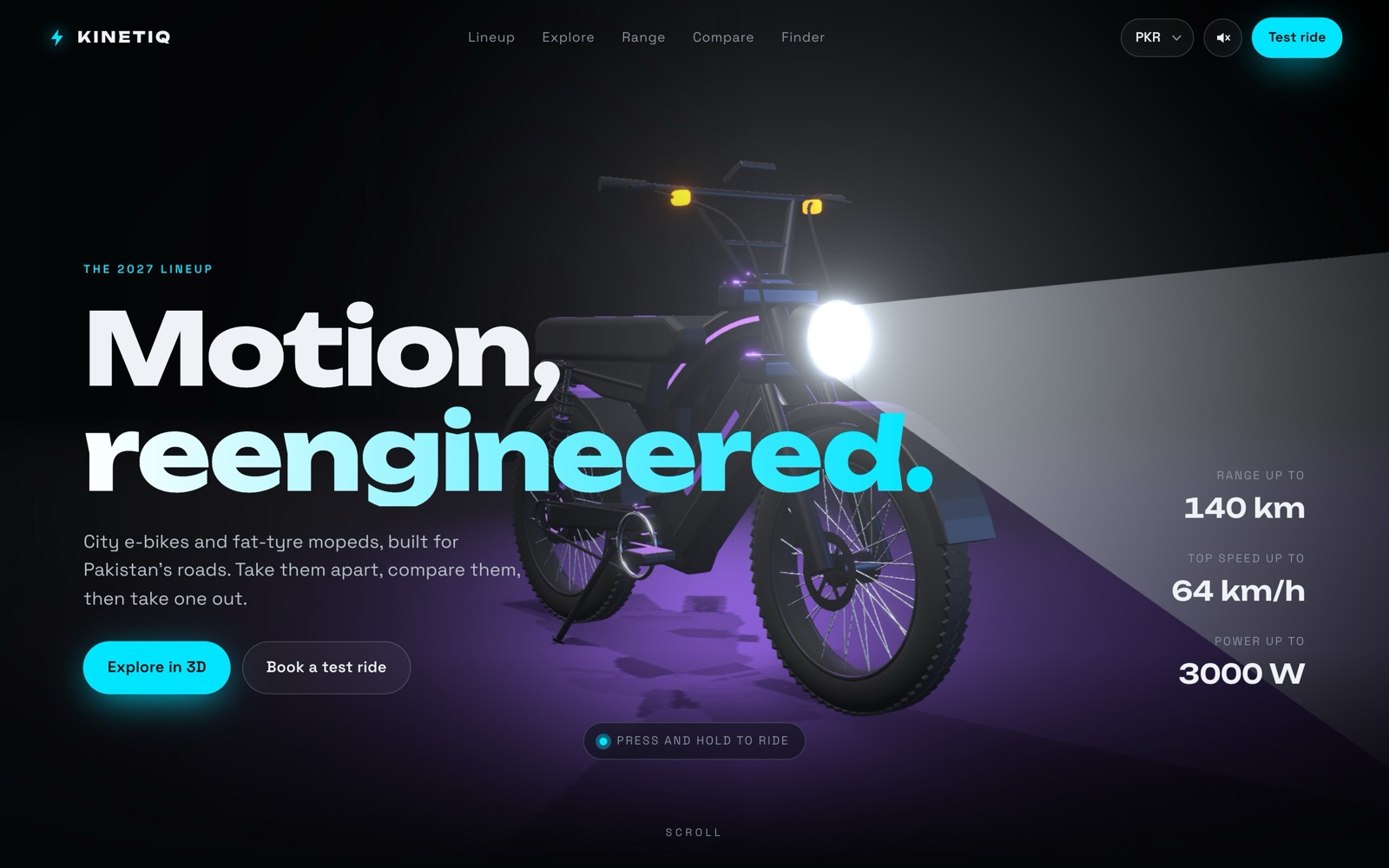
How far can a designer take a 3D product by directing AI?
KINETIQ is a fictional e-bike brand for Pakistan’s roads. I used it to test how far clear direction gets you when Claude writes all of the code.
Whether briefing, references and design critique alone, with no code written by me, can produce a 3D product site that’s believable as a real product.
A product showcase for six e-bikes, with real-time 3D, a range calculator, a compare table, a bike finder quiz and test-ride booking. Bold and playful, but believable as a real product, not a template.
- One day, about two hours of hands-on prompting
- Solo: no developer and no 3D artist
- Claude writes every line of code
- No 3D model files or sound files to start from
- A made-up brand, so no real customers, sales data or brand guide
The customer problem
Why buying an e-bike online is hard. These are assumptions drawn from how e-bikes are usually sold, not research findings.
Range claims are hard to trust.
A single “up to 80 km” figure doesn’t tell a heavier rider on hills what they’ll actually get.
Specs are hard to compare.
Motor, battery, weight and price sit on separate pages, so shoppers keep several tabs open.
Photos hide what matters.
Battery, motor and suspension are hard to judge from a few flat product shots.
It’s unclear which type fits.
Folder, moped, scrambler or dirt bike: first-time buyers don’t know where to start.
It’s a big purchase to make unseen.
Most people want to ride one before they commit.
Design hypothesis
If shoppers can inspect a bike in 3D, see range in their own terms and compare models side by side, they’ll feel confident enough to book a test ride.
Signal to measure: test-ride bookings that start from the explorer, range calculator or compare table. Not yet tested.
Intended audience
- First-time e-bike buyers and daily commuters in Pakistan’s big cities
- Browsing mostly on phones, comparing a few models before visiting a showroom
- Price-aware, shopping in PKR
Who it’s for, and what I assumed about them.
KINETIQ has no real customers, so I didn’t run user research. These are the rider needs and shopping scenarios I designed around. They’re assumptions, not findings.
Rider needs, and the feature that answers each one
“Will it get me through my week?”
→ Range calculator, in days of commuting“Which bike is right for me?”
→ Five-question bike finder“How do these two really differ?”
→ Side-by-side compare“What am I actually buying?”
→ 3D explorer with an exploded view“Can I try it first?”
→ Free 30-minute test rideHypothesis personas
Three provisional personas built from the assumptions above. They’re fictional and haven’t been checked with real riders.
- Goal
- Find an e-bike that suits her without learning the jargon.
- Frustration
- Doesn’t know a folder from a scrambler.
- Likely path
- Bike finder → explorer → test ride
- Goal
- Know one charge covers his week, at a price he can afford in PKR.
- Frustration
- Range claims never match real riding.
- Likely path
- Range calculator → compare → test ride
- Goal
- Pick the best of the two or three bikes he’s already shortlisted.
- Frustration
- Specs are scattered and hard to line up.
- Likely path
- Compare → exploded view → test ride
No user interviews, surveys or usability tests were run for this project. Everything in this section is a hypothesis to test, not a finding.
Assumptions that still need validating
One scroll, from first look to test ride.
In discovery I chose one cinematic scroll over separate pages. Each section answers one buying question, and every path ends at the test-ride booking.
Information architecture
Seven sections, in the order they appear on the site.
- 00 · HeroFirst impression. Press and hold to ride.
- 01 · Line-upAll six bikes at a glance.
- 02 · Explorer3D model, colours, specs and an exploded view.
- 03 · RangeWhat to expect day to day.
- 04 · CompareTwo or three bikes side by side.
- 05 · FinderFive questions to a match.
- 06 · Test rideBook a free 30-minute ride.
User flow
How a shopper moves from exploring bikes to comparing specs, checking range and requesting a test ride. A Test ride link in the menu and a “Test ride this bike” button in the explorer let people jump to booking at any point.
Primary user journeys
Line-upExplorerTest ride
FinderExplorerTest ride
RangeCompareTest ride
Feature prioritisation
- Real-time 3D explorer
- Six bikes with PKR prices
- Book a test ride
- Range calculator
- Compare table
- Bike finder quiz
- Ride mode: stand lifts, speedometer eases
- A headlight with a believable beam
- Press and hold to ride in the hero
Claude wrote the code. I made the design calls.
I directed Claude Code the way I’d run a design team: a kickoff, references, short reviews and clear ownership.
Human–AI responsibilities
- Brief, scope and every product decision
- Reference images and visual direction
- Design review after every build
- Motion, lighting and interaction details
- Discovery questions before any code
- React, Three.js and CSS, about 5,000 lines
- Bikes modelled in code, sounds made in code
- Checking each build in a browser
Claude discovery: 13 questions before a line of code
Claude ran the kickoff workshop and I made the calls. These answers became the spec it built against.
Prompt decisions: six habits
These are my actual prompts. I tidied the spelling but kept the wording. None of them are long; they work because each one does a single, clear job.
Let Claude ask before it builds.
I didn’t write a long spec. I asked Claude to interview me one question at a time, so each requirement got a decision before any code existed.
My first promptI want to create a website for e-bike which have multiple variants. For design an interactive website ask me questions 1 by 1 which you require.
Use references in place of adjectives.
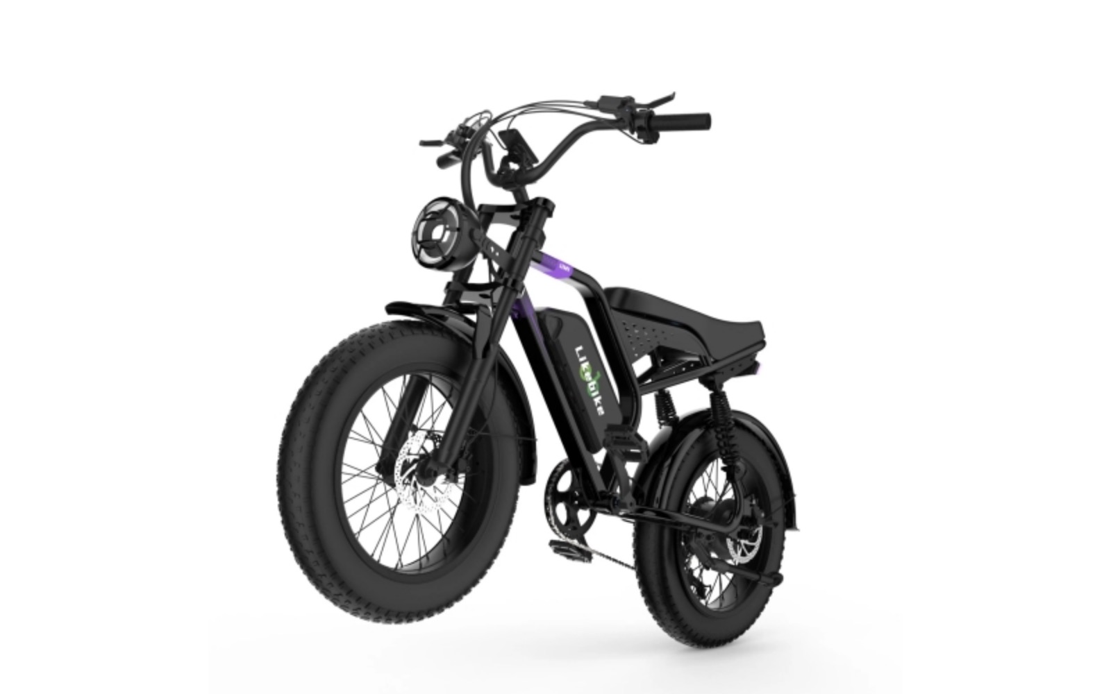
Words like “realistic” or “premium” mean something different to everyone. A photo or a product folder leaves no room for that.
With a reference photoYes, real models of e-bikes, just like the attached image.
With a folder of product shotsIn the attached folder I have added a few product pictures. Can you update the products on the website just like them, but in a 3D look?
Name the flaw and why it breaks the illusion.
The first bikes looked stylish, but an e-bike without a battery isn’t believable. Pointing to the missing part fixed realism across all six models.
Review noteThe bike you used, where are the batteries? Is it a realistic 3D model? I think not.
Describe how it works in the real world.
I didn’t talk about shaders or cone angles. I described where a real headlight’s beam starts and how wide it is, and Claude worked out the 3D maths.
Lighting fixThe light beam does not come from the light. The light beam comes from the front wheel tyre.
Follow-upThe light’s starting output point is narrow. I think it should be approximately the light’s diameter.
Describe the animation as a sequence.
Small, ordered beats are easier to build and check than “make it feel alive”. Each beat became its own piece of behaviour.
Ride modeWhen the ride starts, the stand of the e-bike should go up.
SpeedometerWhen the ride starts, show the speed going up gradually, and when the ride stops it gradually comes down.
Report bugs with a recording.
“It flickers” is hard to act on. A screen recording showed exactly when and where the header animation stuttered.
With a screen recordingCheck this video. The header animation is not running properly in the header and in the 02 — Explorer section.
Reference materials
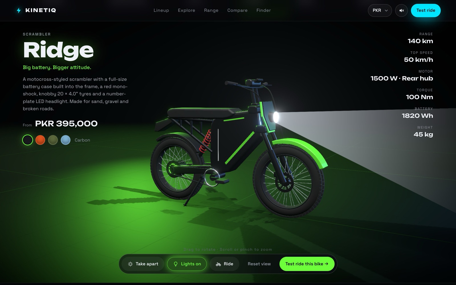
Two reference images, a folder of product photos and one screen recording. The photos made the biggest difference.
The full prompt log
Fifteen messages over one day. Times are local. Most prompts are one sentence; the quality came from the review loop, not from long prompts.
Show all 15 prompts
I want to create a website for e-bike which have multiple variants. For design an interactive website ask me questions 1 by 1 which you require.
Started the discovery interview.Yes, start. One question: do I need Vercel and Git for this?
Approved the plan and checked the setup I’d need.The bike you used, where are the batteries? Is it a realistic 3D model? I think not.
First design review: the models needed to be believable.Yes, real models of e-bikes, just like the attached image.
Added a reference photo.Make this type of model. It is an example.
Added a second reference.Breeze and Breeze Max are not looking real. Add a realistic feel.
Targeted review of two models.In the header the animation is not running properly; it jerks and flickers.
Performance bug report.In the attached folder I have added a few product pictures. Can you update the products on the website just like them, but in a 3D look?
Rebuilt the line-up from real product photos.Check this video. The header animation is not running properly in the header and in the 02 — Explorer section.
Bug report backed by a screen recording.The light beam does not come from the light. The light beam comes from the front wheel tyre.
Lighting accuracy.The light’s starting output point is narrow. I think it should be approximately the light’s diameter.
Beam shape refinement.02 — Explorer: when the ride starts, the stand of the e-bike should go up.
Ride animation detail.When the ride starts, show the speed going up gradually, and when the ride stops it gradually comes down.
Speedometer easing.In the header, if we press the mouse the e-bike starts running.
Press-and-hold to ride in the hero.01 — The lineup: the product images are not good. Can you update them?
Final polish of the line-up cards.
From neon toy to believable product.
The first build worked on the first try but didn’t look real. Each review round fixed one thing: realism, then likeness, then the details.
Before and after
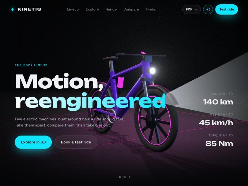
First build: all six sections working, but the bikes were stylised and had no batteries.
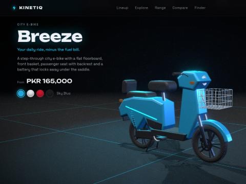
After the reference photos: real proportions, fat tyres, visible batteries and baskets.
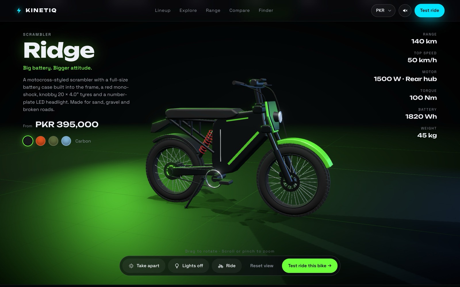
Rebuilt from the product photos, with tuned lighting, ride physics and sound.
Visual corrections Claude couldn’t see
Claude tested every build in a browser before handing it back. None of these problems showed up as errors, so each one needed a designer to spot it.
E-bikes with no batteries.
The first six bikes rendered cleanly and passed Claude’s own checks, but none had a battery. A reference photo fixed it.
Two models still looked fake.
After the realism pass, Breeze and Breeze Max still looked like toys. They needed a second, targeted review.
A bug that came back.
The header animation jerked and flickered. A written report wasn’t enough, so I sent a screen recording that showed exactly where it happened.
Light from the wrong place.
The headlight beam started at the front tyre and was too narrow. It took two notes to get its origin and width right.
Interaction refinement and QA
- The stand lifts when a ride starts
- The speedometer climbs and eases back down
- Press and hold in the hero to ride
- The headlight beam starts at the lamp, at its real width
- Claude: opened each build in a browser, took screenshots and fixed errors
- Me: reviewed realism, consistency, motion and lighting
- A screen recording pinned down the header flicker
Take it apart. Light it up. Ride it.
The 3D explorer is the heart of the site. Lights on, then Ride: the stand lifts, the wheels spin and the speedometer climbs, then eases back down when you stop.
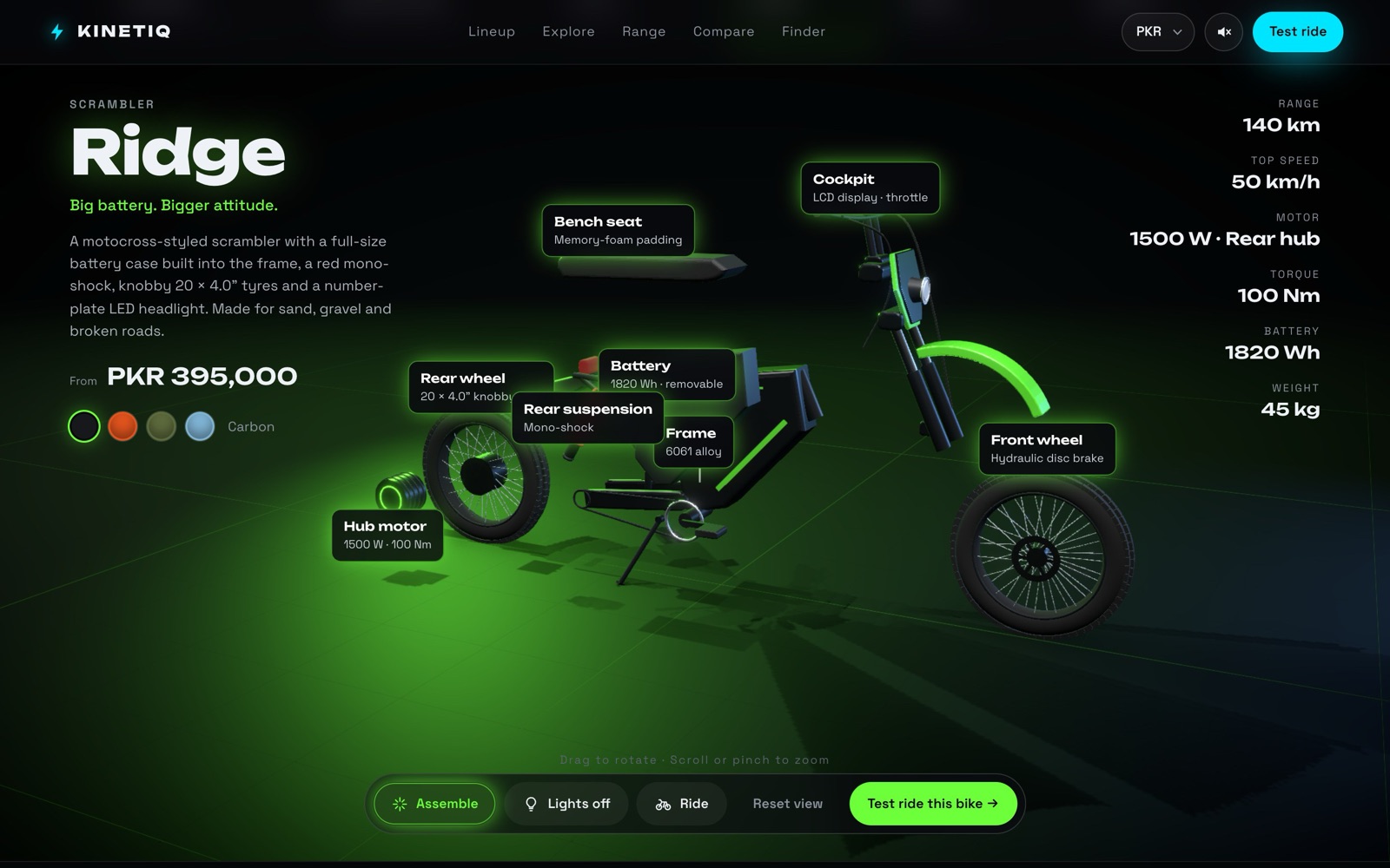
An exploded view with labelled parts.
Take apart spreads the bike into its main parts, each labelled with its spec: hub motor, battery, frame, suspension, wheels and cockpit. Drag to rotate, scroll to zoom.
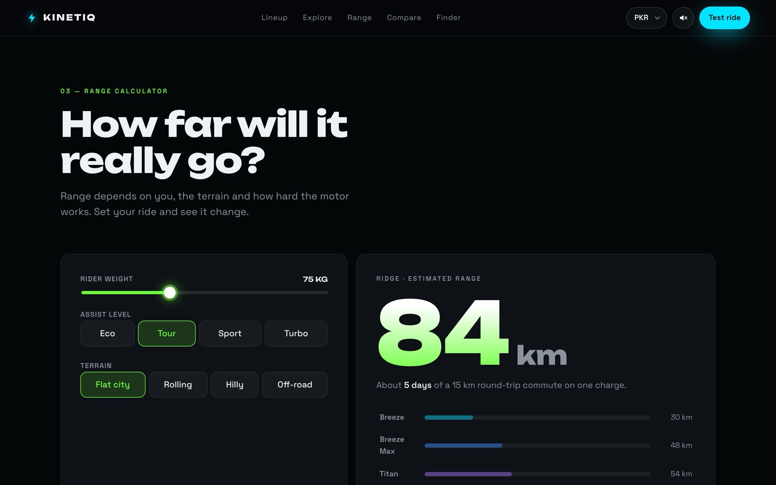
Range you can actually expect.
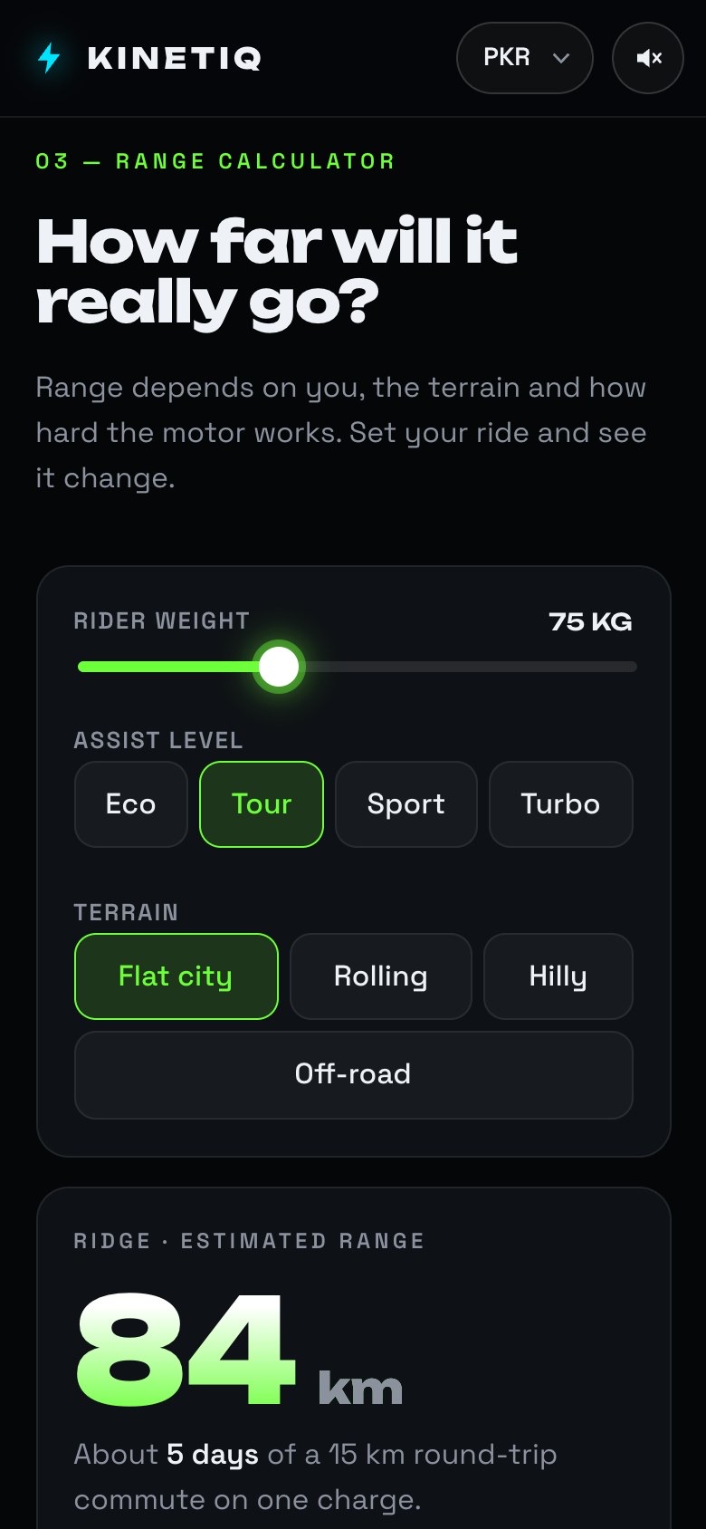
Rider weight, assist level and terrain update the estimate live and turn it into everyday terms: days of commuting per charge, with every bike compared.
The same site on a phone.
Every section stacks to one column. The bike picker scrolls sideways, the price and colours sit above the 3D model, and the calculator controls are big enough to tap.
Open it on your phone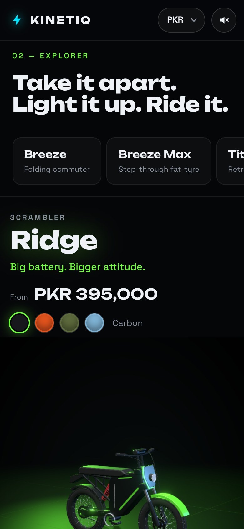
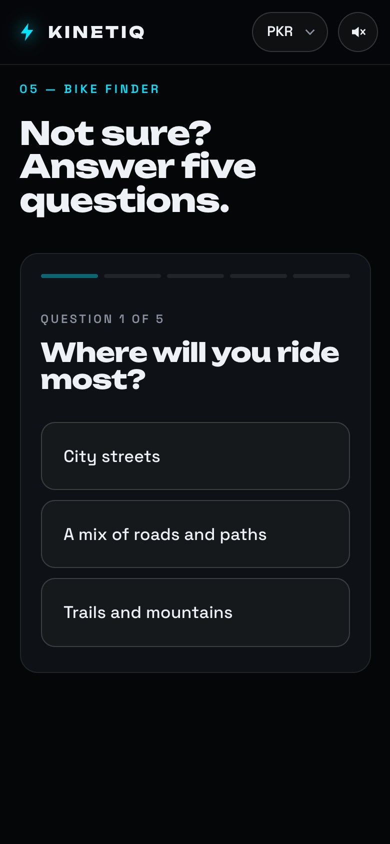
Key screens: comparison, finder and booking
Under the hood
It’s a real Vite project, and the production build runs on this site. Claude chose the stack after I picked “Vite + React” in discovery.
React Three Fiber
Three.js through React, with drei helpers and post-processing for glow. The bikes are built from code, not from model files.
Web Audio API
Motor hum, clicks and the light switch are all made in code, so the site ships no audio files.
React 19 + Vite
29 source files, about 5,000 lines: sections, a shared store, a currency switch and scroll reveals.
Browser-checked
Claude opened each build in a browser, took screenshots and fixed what it found before handing it back to me.
AI writes the code. Design judgement still sets the bar.
What was delivered
Measured results
Measured on the production build. There’s no usability, conversion or customer data for this concept, so none is claimed.
Accessibility and usability checks
A scripted check of the updated live build in Chrome at 1280 px on 8 November 2026. It reads every control, label and text colour. Reduced motion was checked in the code. It isn’t a full WCAG audit or a screen-reader test.
| Check | What I found | Status |
|---|---|---|
| Keyboard | All controls are real buttons, links or form fields, so Tab reaches them. A 2px outline shows focus. The 3D viewer can also take focus. | Pass |
| Form labels | All 8 fields are labelled, including the rider-weight slider, which was missing one in the first build. | Pass |
| Contrast (WCAG AA) | All 287 solid-colour text items pass, including the six small captions that were at 3.25:1 in the first build. Three gradient headlines can’t be scored by script, but both ends of each gradient are light on near-black. | Pass |
| Reduced motion | With reduced motion on, the 3D hero holds a still view, camera moves cut instead of fly, floor streaks stop, and scroll reveals, count-ups and smooth scrolling are off. Checked in the code, not with a motion-sensitive user. | Pass |
| 3D alternatives | The 3D viewer now has a text description that names the bike, colour and state, and arrow keys rotate, + and − zoom, and R resets. Specs, price, colours and parts are also shown as text. Not yet tried with a screen reader. | Pass |
| Hero ride | Press and hold to ride is now a real button, so keyboard users can hold Space or Enter on it. | Pass |
| Usability testing | No sessions with real shoppers yet. | Not done |
Limitations
- Not tested with real riders or buyers
- The personas and assumptions in section 03 are still unvalidated
- Range figures come from made-up specs, not real battery data
- Frame rate on phones wasn’t measured
- Accessibility was checked by script and in code only (8.3), not with a screen reader or disabled users
Proposed next steps
- Run a short usability test of the finder, range calculator and booking with e-bike shoppers
- Test the 3D viewer and booking form with VoiceOver and NVDA, now that the 8.3 gaps from the first build are fixed
- Measure frame rate on mid-range Android phones and add a lighter 3D mode if needed
- Check range estimates against real battery and motor specs
- Track test-ride bookings by starting section to test the hypothesis in 2.2
What I learned
Ask to be asked.
Thirteen questions up front cost a few minutes and saved hours of rework. It’s the same reason we run a kickoff.
References beat adjectives.
The biggest jump in quality came from one folder of product photos, not from a better-written prompt.
Review like a design lead.
Short, specific notes about what feels wrong and why moved the work further than any long instruction did.
“It runs” isn’t “it’s right”.
Claude was good at checking its own code and blind to what looked wrong. Taste, realism and feel still need a person.